

HOT TOPICS LIST
- Strategies
- Stocks
- Buy
- Investing
- Brokers
- Psychology
- Interviews
- Accumulate
- Sell
- Hold
- Spotlight
- Websites
- Candlestick Corner
- Gold & Metals
- Options Trading
LIST OF TOPICS
INVESTING
Candlestick Close-up: Three White Soldiers
03/26/01 11:43:56 PM PSTby Sharon Yamanaka
This candlestick formation is hundreds of years old, but it can still help you predict changes in a price trend.
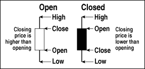
| Candlestick charts originated in 17th-century Japan, but were only introduced to the United States by analyst Steve Nison in the late 1980s. Once US investors found out about candlestick charting, it quickly became a popular technique for analyzing stocks. Candlestick charts offer a quick, at-a-glance summation of a day's worth of trading information, which many investors prefer to the standard bar chart. Figure 1 illustrates how candlestick bodies highlight the opening and closing price and the stock's direction for the day. The overall movement of the stock is easily visible on a chart; more closed bodies (colored red or black) means the stock is headed down, and more open bodies (colored white or green) means the stock is moving up. When the candlesticks display formations or patterns, they can help stock analysts gauge market sentiment, which can be used to anticipate short-term movements in the stock price.
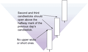
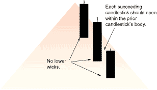
The white soldiers pattern is easy to recognize; it even jumps out on yearly charts. Look for three long white candlestick bodies marching upward like stairsteps. The classic formation, shown in Figure 2, follows these rules:
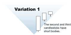
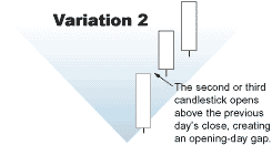
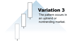
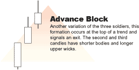
WHAT DOES IT MEAN? The soldiers formation suggests that a stock is rallying, but not necessarily that the rally will continue. The overlap of the three bodies -- opening at a lower price than the price at which they closed -- is considered a healthy sign for an uptrend; not a fast one, but one that shows the possibility of a strong move upward. The overlapping candlestick bodies imply that there is some profit-taking from the recent price rise -- a positive sign. When the candlestick bodies are too long or gap upward (that is, they open at a price higher than the closing price of the previous day), showing no selloff, analysts look at the stock with suspicion because the chart may indicate the quick, unsustainable climb rather than a change in the overall trend. EXCEPTIONS TO THE RULES Once you are able to recognize the classic formation and the significance of its various components, you can move on to recognizing variations of it. The classic formation occurs infrequently, so you are more likely to identify one of the several variations:
FIGURE 2 illustrates the variations of the three white soldiers, as well as some useful exit formations.
APPLYING IT If you follow a particular stock for any length of time, you will be able to get a feel for its behavior. You will be able to:
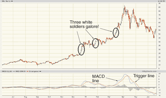
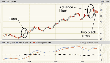
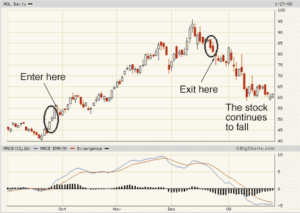
With all this information in hand, you can get a good picture of the strength of a candlestick formation relative to the stock's overall character. The possibility of flipping or clicking through charts on the Internet eliminates the need to draw these charts by hand. You can also quickly scan huge amounts of data to look for white soldiers. In Greg Morris's CandlePower, he rated the effectiveness of candlestick formations for three-, five-, and seven-day intervals. He found a whopping 75% average effectiveness rate on the classic three white soldiers formation, and the three black crows formation was not far behind. This is an amazing statistic, if hard to believe, in an arena where any indicator above 50% accuracy is considered tradable, thus placing these two formations in the high end of reliability. THE PACKAGE: ENTRIES AND EXITS If you want to take advantage of the candlestick formations on more than an opportunistic level, you can combine them with a second indicator. I use the second indicator for the long term, and the candlestick, whose formations are considered to be very short term (a three-day formation can predict the next three to seven days' stock movement), as the actual entry signal. I started by pulling up a chart of a target stock in which I'm interested -- in this case, a one-year chart of America Online (AOL). First, I opened the bar chart, then converted it to candlesticks (see sidebar "How to get a custom chart on BigCharts.com"). I noticed several white soldier formations seemed to be occurring at the right places -- points of uncertainty during market activity (Figure 3). Great! Although white soldiers are a bottom trend-reversal signal and work best when a stock is trending down, they can still signal a strong entry when a stock is going sideways or trading within a price range. White soldiers that are formed when there is no clear downtrend need to be watched carefully.
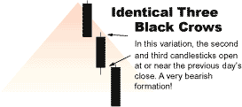
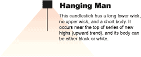
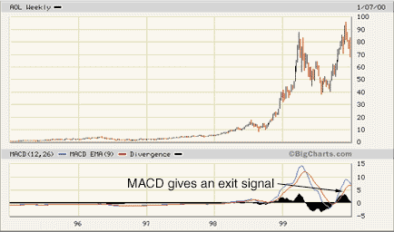
In Figure 3, you can see that the MACD and white soldiers are giving buy signals at about the same time on two occasions. For entry and exit signals using the MACD, see sidebar "In... and out." Exits are important, too. Based on previous chart patterns, I have found the three black crows and hanging man patterns to be reliable exit signals:
1 Three descending long, black candlesticks, each closing at or near their low (no lower wicks) for the day.
1 A short body with a long, lower wick that extends to at least twice the length of the body. The long lower wick indicates a sharp selloff, followed by a rally that closes near the day's high. It's considered slightly more bearish if the body is closed, indicating that the rally failed to rise to the opening price. The actual signal I got in the example in the sidebar "In... and out" was the advance block, a variation of the three white soldiers. When the stock dropped and two black crows appeared, I didn't wait for the third one. I sold my stock. MARCHING TO THE BEAT Using candlesticks can be as simple or as complex as you care to make it. Candlesticks are a marvelous way to initiate yourself into the world of stock market charting. By themselves, candlesticks take advantage of stock market formations and market sentiment and introduce the use of trends, rallies, reversals, and entry and exit points. In conjunction with a second indicator, they can become a powerful tool to increase and protect your investments. And that, after all, really is the name of the game, whether in old-time Japanese or modern English.
IN. . . 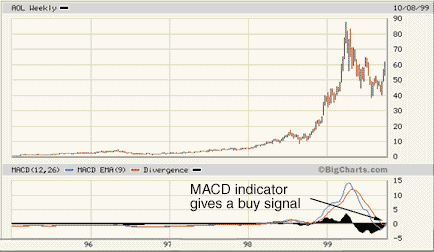 Pick a stock and pull up its five-year chart Look for a buy signal from the MACD indicator 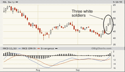 Pull up a three-month chart and look for three white soldiers . . . AND OUT
Back to the five-year chart
Looking for an exit CONCLUSION
The big picture
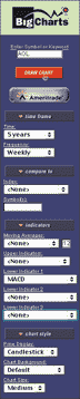
SIDEBAR FIGURE 1: BigCharts interactive chart controls. How to get a custom chart on BigCharts.com Put in your ticker symbol, then click on Interactive Charting to get the menu seen on the left.
Copyright © 2001 Technical Analysis, Inc. All rights reserved. | ||||
| Title: | Staff Writer |
| Company: | Technical Analysis, Inc. |
| Address: | 4757 California AVE SW |
| Seattle, WA 98116 | |
| Phone # for sales: | 206 938 0570 |
| Fax: | 206 938 1307 |
| Website: | www.Working-Money.com |
| E-mail address: | syamanaka@traders.com |
Traders' Resource Links | |
| Charting the Stock Market: The Wyckoff Method -- Books | |
| Working-Money.com -- Online Trading Services | |
| Traders.com Advantage -- Online Trading Services | |
| Technical Analysis of Stocks & Commodities -- Publications and Newsletters | |
| Working Money, at Working-Money.com -- Publications and Newsletters | |
| Traders.com Advantage -- Publications and Newsletters | |
| Professional Traders Starter Kit -- Software | |
PRINT THIS ARTICLE

Request Information From Our Sponsors
- StockCharts.com, Inc.
- Candle Patterns
- Candlestick Charting Explained
- Intermarket Technical Analysis
- John Murphy on Chart Analysis
- John Murphy's Chart Pattern Recognition
- John Murphy's Market Message
- MurphyExplainsMarketAnalysis-Intermarket Analysis
- MurphyExplainsMarketAnalysis-Visual Analysis
- StockCharts.com
- Technical Analysis of the Financial Markets
- The Visual Investor
- VectorVest, Inc.
- Executive Premier Workshop
- One-Day Options Course
- OptionsPro
- Retirement Income Workshop
- Sure-Fire Trading Systems (VectorVest, Inc.)
- Trading as a Business Workshop
- VectorVest 7 EOD
- VectorVest 7 RealTime/IntraDay
- VectorVest AutoTester
- VectorVest Educational Services
- VectorVest OnLine
- VectorVest Options Analyzer
- VectorVest ProGraphics v6.0
- VectorVest ProTrader 7
- VectorVest RealTime Derby Tool
- VectorVest Simulator
- VectorVest Variator
- VectorVest Watchdog