

HOT TOPICS LIST
- Strategies
- Stocks
- Buy
- Investing
- Brokers
- Psychology
- Interviews
- Accumulate
- Sell
- Hold
- Spotlight
- Websites
- Candlestick Corner
- Gold & Metals
- Options Trading
LIST OF TOPICS
CHART ANALYSIS
Identifying Patterns
11/05/01 03:47:57 PM PSTby Dennis D. Peterson
Identifying patterns can be helpful, even when you're looking at charts.
What can you use to analyze price charts? There are many tools available, but some of the most popular, like moving averages, have their fair share of problems. What else can you use? Chart patterns. When you first start looking at price charts, the stock activity may look like the product of a random generator. Once you start to look for patterns, though, charts take on a new perspective.
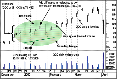
TRIANGLES: ASCENDING AND DESCENDINGHere's a pattern that's easy to visualize, and this particular example has almost all the classic elements of pattern reading. An ascending triangle (Figure 1) is easy to spot. It has a horizontal resistance line along the top and a support line that slopes upward. The chart displayed in Figure 1 is of the Nasdaq 100 tracking index (QQQ). The length of the base of the triangle from $79 to $98 on January 3, 2000, is what you would add to the horizontal line to find the next level of resistance. Adding $19 ($98%AD$79) to $98 results in $117. On March 10, 2000, QQQ reached a high of $116.5. The initial reaction when you find these patterns going according to plan is one of excitement.
Figure 1: Nasdaq 100 Tracking index (QQQ). An ascending triangle was formed during January. Resistance was at around $98 and support was sloping up.
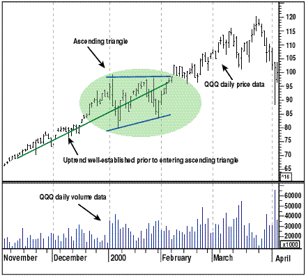
But reality soon sinks in. First, ascending triangles aren't frequent. Second, prices should be in an uptrend coming into the ascending triangle, which they were in this case, gaining 15 points from December 15, 1999, to January 3, 2000. Finally, your odds will be increased if the horizontal resistance is broken with a price gap up. The good news was that on February 8, 2000 (Figure 1), price gapped up, but the bad news was that volume associated with the gap up was below average. Still, all the elements were there. Odds favored QQQ to go up. When you're looking for patterns, the first thing you need to do is identify resistance and support. The second is to look at volume, which tells you how the market views support and resistance. The third is to realize that some patterns occur with a high frequency, but sometimes there are no patterns. Resist letting your imagination create something that is not there, because there are enough recognizable patterns in enough stocks to keep you trading all the time. The chart in Figure 1 is somewhat biased, because you can see what happened afterward. If you look at price going back two months, it is clear that QQQ was in an uptrend (Figure 2). Using a couple of weeks of price history, as I did in Figure 1, is about the minimum to justify a trend.
Figure 2: Using a longer time frame. Prior to the ascending triangle, there was a strong upward trend.
Why patterns occur has a lot to do with market psychology. An ascending triangle represents a point in time when traders are having some doubts about continuing the current trend. The key to an ascending triangle? Each time selling occurs (a test of support), the buyers are there to jump on the availability of the equity at a lower price. As time goes by, each selling is matched by raising the support level higher, and this results in a rising support slope. A descending triangle, on the other hand, has a horizontal line as its support and a downward-sloping line as its resistance. An ascending triangle is bullish and a descending triangle bearish. Notice I didn't say "ascending" means price is going up, or "descending" means price is going down. The trend coming into the pattern should fit with the pattern, and the price should gap before you commit any trading funds.
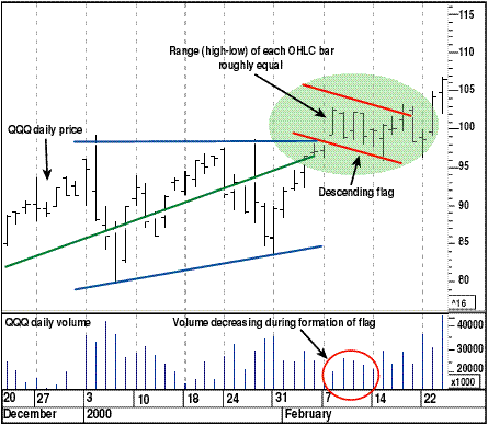
FLAGSBut if prices gap up on below-average volume as they did with QQQ on February 8, 2000, would you want to place a trade? Gapping up on thin volume is evidence that the market lacks enthusiasm for the move up; the market will now test whatever enthusiasm exists. What forms next is one of the more common trend patterns: a flag (Figure 3), so named because of its appearance, which is created by having nearly equal trading ranges. The trading range is the difference between today's high and low.
Figure 3: Flag formations. A flag formation is characterized by prices being within daily ranges. A flag that slopes down indicates the continuation of the bullish trend, while one that is sloping up indicates the continuation of a bearish trend. If you examine the open-high-low-close (OHLC) bars in the flag formation, you would see that on the day following the gap up, price turned down because the high was at the open and the low was at the close. The next day (February 10, 2001), there was a complete turnaround. Selling was matched by buying on an interday basis, as opposed to intraday. A downward-sloping flag is bullish; price is being driven down but is continually meeting support. Volume is decreasing slightly with each successive attempt down in price, and enthusiasm to sell is diminishing. Finally on February 14, a telltale sign emerges: a narrow-range bar where the open and close are nearly equal and are in the upper 20% of the trading range. Too much, you say! It would be easier to understand quantum physics! Narrow range with open and close in top 20%? Patterns occur over weeks, a few days, or sometimes during the course of one trading day. A narrow-range bar means the market is catching its breath. When volatility — that is, the range of prices — diminishes, the market will start to move again. Ah, but in what direction? With the flag formation, the odds favor the market going up. Now you might also have had enough with this odds business. You want to know what works all the time. Nothing works all the time, which is why you need to use stop orders. What differentiates successful traders from the others? It's simple — successful traders minimize losses by utilizing stops. The point here is not to lecture about stops, but to point out that patterns exist on different levels. With each level, while you may use different techniques, you should always try to determine whether the market is bullish or bearish and whether traders are buying or selling.
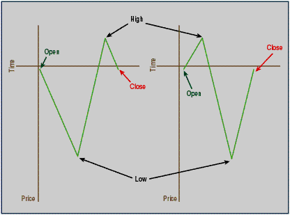
Figure 4: Intraday price patterns. Each pattern results in the open and close being in the top 20% of the trading range and could be either bullish or bearish, depending on whether it is an uptrend or downtrend. The significance of the open and close prices being at the top 20% of the range is that if you examine the intraday price patterns and there are only two and one is bullish (Figure 4), then you are in an uptrend. The two possible patterns are either short-selling followed by covering (buying back the stock — a downtrend phenomenon), or profit-taking followed by buying demand (an uptrend phenomenon). Given that you have an ascending triangle preceded by an uptrend and a price gap up, odds favor that a bullish flag will end with the trend continuing on up; the open and close being at the top 20% of the constricted range confirms continued bullishness and is a signal the market is about to go back up again.
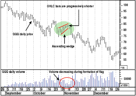
WEDGESThe last pattern I want to discuss is the wedge. It follows the same rules as a flag. Descending flags and wedges are bullish, and ascending flags and wedges are bearish. Wedges are the most common continuation pattern found in a trend. If you see a rising wedge in a downtrend, don't think it's a trend reversal; it's a pause in the downtrend and will continue on down (Figure 5). A wedge is characterized by a series of OHLC bars that progressively get shorter and each bar is a little higher than the previous one. It's accompanied by a decrease in volume, which suggests that as prices rise there are fewer buyers. Typically, a wedge sees a sharp downturn within a day or two near its completion.
Figure 5: Ascending wedge. An ascending wedge is a bearish pattern and if found in a downtrend is a continuation of the downtrend.
USING PATTERNS TO YOUR ADVANTAGETriangles, flags, and wedges are patterns that are found within trends and they can be used to your advantage. When you're analyzing trends it means you're analyzing patterns. Suppose you are using the popular moving average to see if a trend has changed direction. What will a descending flag or wedge — a continuation of an uptrend — do to, say, a moving average during an uptrend? Even though moving averages are well suited for trends, if you are using short periods it will look like a trend reversal, which means it is time to sell. As the trend moves up again, it is time to buy again, but with some lag — typical when using moving averages. This is not the worst scenario. Suppose your equity moves sideways — a movement characterized by up and down price swings. If you're using a lagging indicator such as a moving average, you can easily be caught going long just as price moves down and going short just as price swings up. This is known as being whipsawed.
SETUPS AND STOPSTo avoid being caught in a whipsaw, successful traders will tell you that you must have setup and stop strategies. Setups are the conditions that need to occur prior to entering a trade; the actual entry decision is often based on how the market opens the next day, while stops are used to minimize losses. Your setup for using a pattern is to first recognize whether the market is bullish or bearish. For that, you can use market breadth. For the patterns I have covered, the next element of your setup condition is the trend direction; you can use daily data for this. Finally, if everything indicates it's a go, you will have to decide what will make you enter a trade. For an ascending triangle, preceded by an uptrend, it could be a gap up. This could, however, be a false breakout; after a few days, prices might go down instead of up, and that's why you must use stops. To determine if the profile is bullish or bearish for your entry condition, you should use intraday data. When you see a gap up it is a bullish sign, but you want volume to confirm. You could put in a buy-stop order the night before to assure that your order only gets filled tomorrow if price has moved up, but you'll want to check to see if price has gapped up, as opposed to moving up, and that volume is above average. Otherwise, cancel the order.
Dennis Peterson may be reached at DPeterson@Traders.com.
SUGGESTED READINGPeterson, Dennis [2001]. "Market Breadth or Beta?" Working-Money.com, November.MetaStock (Equis International)
Current and past articles from Working Money, The Investors' Magazine, can be found at Working-Money.com. |
Market index trading on a daily basis.
| Title: | Staff Writer |
| Company: | Technical Analysis, Inc. |
| Address: | 4757 California Ave SW |
| Seattle, WA 98116-4499 | |
| Phone # for sales: | 206 938 0570 |
| Fax: | 206 938 1307 |
| Website: | working-money.com |
| E-mail address: | dpeterson@traders.com |
Traders' Resource Links | |
| Charting the Stock Market: The Wyckoff Method -- Books | |
| Working-Money.com -- Online Trading Services | |
| Traders.com Advantage -- Online Trading Services | |
| Technical Analysis of Stocks & Commodities -- Publications and Newsletters | |
| Working Money, at Working-Money.com -- Publications and Newsletters | |
| Traders.com Advantage -- Publications and Newsletters | |
| Professional Traders Starter Kit -- Software | |
PRINT THIS ARTICLE

Request Information From Our Sponsors
- StockCharts.com, Inc.
- Candle Patterns
- Candlestick Charting Explained
- Intermarket Technical Analysis
- John Murphy on Chart Analysis
- John Murphy's Chart Pattern Recognition
- John Murphy's Market Message
- MurphyExplainsMarketAnalysis-Intermarket Analysis
- MurphyExplainsMarketAnalysis-Visual Analysis
- StockCharts.com
- Technical Analysis of the Financial Markets
- The Visual Investor
- VectorVest, Inc.
- Executive Premier Workshop
- One-Day Options Course
- OptionsPro
- Retirement Income Workshop
- Sure-Fire Trading Systems (VectorVest, Inc.)
- Trading as a Business Workshop
- VectorVest 7 EOD
- VectorVest 7 RealTime/IntraDay
- VectorVest AutoTester
- VectorVest Educational Services
- VectorVest OnLine
- VectorVest Options Analyzer
- VectorVest ProGraphics v6.0
- VectorVest ProTrader 7
- VectorVest RealTime Derby Tool
- VectorVest Simulator
- VectorVest Variator
- VectorVest Watchdog