HOT TOPICS LIST
- Strategies
- Stocks
- Buy
- Investing
- Brokers
- Psychology
- Interviews
- Accumulate
- Sell
- Hold
- Spotlight
- Websites
- Candlestick Corner
- Gold & Metals
- Options Trading
LIST OF TOPICS
THE CHARTIST
Trendlines And Consolidations
03/05/02 04:03:05 PM PSTby Dennis D. Peterson
Here's a technique that produces more accurate trendlines.
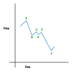
| Drawing trendlines correctly is more challenging than many traders realize. The rule is that the more peaks and valleys you connect with a straight line, the more valid the line is in defining a trend. But simply connecting a set of the more prominent peaks or valleys can cause you to miss consolidations, since the smaller peaks and valleys that are skipped over could be defining a consolidation pattern. Consolidation patterns are important because they can be used to gauge how much farther an equity will move. When an equity is traded it is either in an uptrend, a downtrend, or it is moving sideways. There are two types of sideways movements. One is what might be called an accumulation phase, which is a series of daily price changes that vary less than 5%. If the price was $50, then price would vary no more than $2.50 for several weeks. The other type of sideways price movement, a consolidation, is one where price moves up and down by 5% or more in a channel. Keep in mind that patterns you want to trade should have high average daily volume. Some would like to see at least 500,000 shares per day, but I prefer the number to be closer to one million. I have found the key to defining trendlines is to use pivots; doing so makes consolidations more apparent. It also allows you to practice a useful analysis technique called the Andrews pitchfork*. Pitchforks deserve their own discussion, but let's focus for now on drawing trendlines using pivots, and the benefits of doing so. A DOWNTRENDING EQUITY Figure 1 is a simple illustration of an equity whose price is in a downtrend. Each of the peaks and valleys is a pivot. To define a pivot, look for two lower trading bars before and after a pivot peak, and similarly, higher bars on each side of a valley pivot. (See my Working Money article "What Are Pivots?")
Figure 1: Idealized downtrend with consolidation. Each peak and valley, A through E, is a pivot, with a clear downtrend evident from point A to F and a sideways move from B to E. You can put more risk in your analysis by having just one lower bar before and after a peak, or you can be more conservative and require three bars (a valley is similar, with either one or three bars being higher than the pivot valley). Let's apply this method to the Nasdaq Composite, a popular index that is analyzed extensively (see Figure 2).
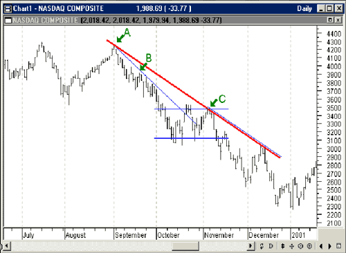
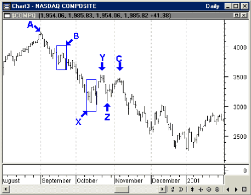
Figure 2: Daily Nasdaq Composite prices. The red trendline satisfies the condition that a straight line connects two or more peaks, but it misses the consolidation in October. The blue lines are an alternative set of trendlines connecting several pivots. The natural tendency is to just start connecting peaks with a straight line (red line). But first you should identify the pivots. Before that, you must decide what constitutes a pivot in terms of meaningful price action. Again, I prefer at least two bars before and after a high or low to define a peak or valley. Using this two-bar rule, we can identify the pivot point labeled B in Figure 3. By connecting points A and B (blue trendline) and extending the line to October, it becomes apparent that the downtrend was broken in mid-October. This leads you to wonder what direction price will take next. The ensuing price action is a sideways movement defined by pivots X, Y, Z, and C (Figure 3).
Figure 3: Nasdaq daily price. The price bars leading up to and following pivot B have been identified in the blue square. Pivots Y and Z share bars, since the two bars lower than pivot peak Y are the same two bars higher than valley Z. Before continuing, let's consider another way pivots can be significant. A pivot is a point where a price turnaround occurs, and by definition some traders profit and some don't (especially if they don't use stops to take themselves out of a position). The market has yet to return to these levels (Figure 3; prices at pivots X, Y, Z, and C), and it will probably "remember" them, because those who bought on the dips at pivots X and Z have seen prices go on down. When prices return to these levels now, those who were caught before are likely to want to sell. The longer it takes to return to these levels, the more likely it is that market participants have given up in disgust and taken their losses. The volume matters in this analysis as well, since the volume at any given pivot gives you a measure of how many traders were caught long or short, and thus, how strong the market's "memory" (resistance or support) will be at this level. By late November it is clear that prices have finished consolidating. Your next question might be, "What is the likely pivot point for the next major move?" This is where consolidations become significant.
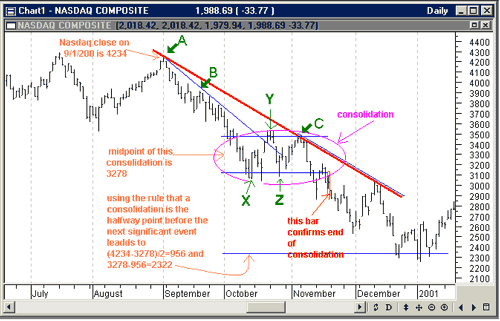
CONSOLIDATIONSConsolidations often occur halfway through major moves. This allows you to estimate the duration of a trend by finding the distance between the start of the move and the consolidation. On September 1, 2000 (pivot A), the Nasdaq Composite closed at 4234. The midpoint of the consolidation is at 3278, so the continuing downtrend should see the pivot for the next major move at 3278-(4234-3278)=2322. The chart confirms this estimation the next move is an upswing at around 2322 in early January 2001 (Figure 4).
Figure 4: Nasdaq daily price. Again, the rule is that consolidations mark the halfway point in major moves. A major move could consist of trends interrupted by several consolidations. The longer and more volatile a consolidation, the more likely it will result in a strong move to continue the trend. Consolidations can also occur at tops and bottoms, but for this method you need to look for prices that are breaking out of the consolidation pattern in the same direction they entered. That is why you would wait until late November to determine that you haven't seen a bottom but a consolidation. The key is the bar circled in red (Figure 4). Two bars prior to that is a pivot peak, which tells you the market has decided where it's going to go — that is, down. You would place an order to short Qqq on November 17, 2000, after seeing the high of that day was not going to be any higher than the midpoint of the previous day. This gives you an idea of how far to ride this trend. Consolidations also exhibit some other behaviors that are useful. Figure 5 identifies some trendlines, consolidation lines, and one symmetrical triangle.
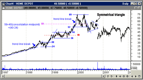
Figure 5: Daily price chart of Home Depot (HD). When you analyze a chart you should look for both trends and consolidations. The market considers trends in three ways — first, a gradual change is tolerated and not likely to have consolidations because they are not needed; second, faster changes will be challenged with consolidations to test the price rate change; and third, extreme rates of changes are going to end up as either intermediate or major tops or bottoms.
Stocks spend most of their time going sideways, versus being in uptrends or downtrends. From early 1997 to early 1998, Home Depot (HD) is in a long gradual uptrend. The rest of the chart, starting with the first trendline break, is more typical price action, with steeply sloped trendlines and consolidations. The steeper the slope of a trend, the more unsustainable it is, whether it's moving up or down. Let's analyze this chart, going from left to right:
From this analysis you can see that the width of the consolidation can be used, the midpoint of a consolidation can be used, and that if you compare the slopes of the trendlines, you can anticipate that the market is going to want to think about what it has done. HD topped with an M pattern, which is a short consolidation. In addition, when you look at the price chart of Home Depot, it should seem obvious that unless something dramatic occurs, 52 is the highest price the market will pay for HD for a while. As an aside in this discussion, let's look at the symmetrical triangle on the chart in the second half of 2000. Is there any predictive value in this pattern? This triangle pattern calculation is worth mentioning because it is similar to the rules for consolidations. The rule for triangles is to use the length of their base as the amount of movement predicted when a stock breaks out of the triangle pattern. In this case the lower end of the base is at 47 (May 22, 2000), while the upper end is an extrapolation of the upper trendline to May 22 with HD at about 64. The base is therefore 64-47=17, and the axis of the triangle about 52, so the move down from the triangle pattern should end at 35 (52-17), which it does.
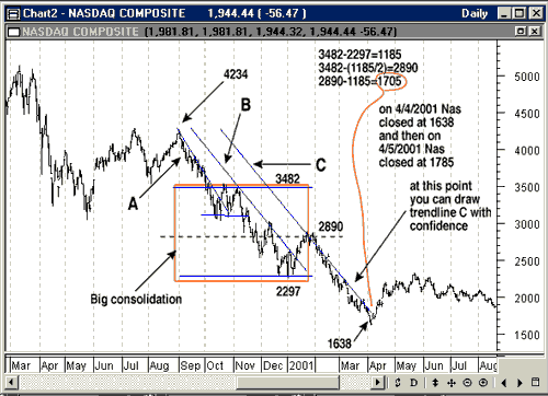
NOW ON THE NASDAQWhat would you learn if you were to apply the same consolidation pattern analysis technique to the Nasdaq Composite? By mid-March 2001, the chart of the Nasdaq Composite displayed in Figure 6 exhibits three trends — the last two are roughly parallel, and the first one has a slope that's a bit steeper than the other two. In fact, the steepness of the first trendline (A) only portends a rebound at some unspecified, future time, and of course it comes initially at pivot X in mid-October 2000 (Figure 4). By mid-March 2001 it is possible to draw a third trendline. When you see three roughly parallel trendlines, each displaced to the right, you know that the trend will be displaced because price has moved sideways. So what is this big "consolidation" area?
Figure 6: Applying consolidation pattern analysis to the Nasdaq. When you see consecutive parallel trend lines shifted to the right, you have to assume price has gone sideways. The pivot peak of 3482 and a pivot valley of 2297 define this area, since they are the pivots defining the extremes. You may think this doesn't look like price moving sideways, but it is. It moves sideways, then down, and then sideways again. What you should see is a downswing in prices leading to the "consolidation" and a downswing leaving it. This variation works often enough to warrant taking the time to construct it. My midpoint is 2890, (3482+2297)/2, and my estimate of a turning point is 2890-1185=1705, where 1185 is the width of the "consolidation." After hitting 1638 for a low, the next day the Nasdaq Composite opens at 1706. And how is 2297 holding up as resistance? The highest the Nasdaq composite has reached is a close at 2313 on May 22, 2001. So far it is resisting strongly — it seems the market is remembering. The close of 2313 is followed by a close of 2243 on May 23.
Dennis Peterson may be reached at DPeterson@Traders.com.
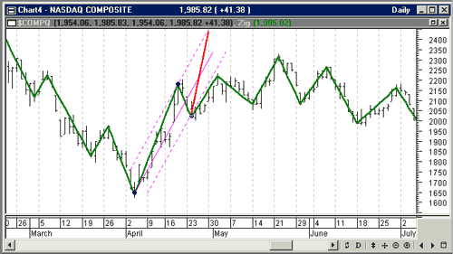
SIDEBARANDREWS PITCHFORK Curious about the Andrews pitchfork? Refer to the daily chart of the Nasdaq Composite displayed in sidebar Figure 1.
Sidebar Figure 1: Applying the Andrews pitchfork. Daily price is overlaid with a zigzag using a 6% change. An Andrews pitchfork is drawn using the bottom at 4/4/01 and two pivots at 4/20/01 and 4/26/01. The two dashed magenta lines form the envelope for prices to move within. Take a pivot high or low and find the next two pivots (B and C). Next, draw a line from the pivot high or low (A) through the midpoint of the other two pivots (solid purple line). Construct two lines parallel to the line going through the midpoint, but place these two lines at each of the two pivots to form a channel (dashed purple lines going through pivots B and C). You now expect price to move within this channel. One of the features of this device is that you can foresee a problem. After constructing the pitchfork, price would have to follow the red line to hit the upper channel, which is not even remotely likely. The price does something more rational and moves outside the envelope, which reveals the most likely case for price movement. By looking at the pitchfork, you can make a good estimate of what's likely to happen next. This is one of the reasons that chart technicians are wary of fast-climbing stocks. — DDP
SUGGESTED READINGBulkowski, Thomas [1998]. "Double Tops," Technical Analysis of Stocks & Commodities, Volume 16: January.Peterson, Dennis [2002]. "What Are Pivots?" Working Money, January. Star, Barbara [1995]. " Support And Resistance With The Andrews Pitchfork," Technical Analysis of Stocks & Commodities, Volume 13: November. MetaStock (Equis International)
*See our online cumulative glossary
Current and past articles from Working Money, The Investors' Magazine, can be found at Working-Money.com. |
Market index trading on a daily basis.
| Title: | Staff Writer |
| Company: | Technical Analysis, Inc. |
| Address: | 4757 California Ave SW |
| Seattle, WA 98116-4499 | |
| Phone # for sales: | 206 938 0570 |
| Fax: | 206 938 1307 |
| Website: | working-money.com |
| E-mail address: | dpeterson@traders.com |
Traders' Resource Links | |
| Charting the Stock Market: The Wyckoff Method -- Books | |
| Working-Money.com -- Online Trading Services | |
| Traders.com Advantage -- Online Trading Services | |
| Technical Analysis of Stocks & Commodities -- Publications and Newsletters | |
| Working Money, at Working-Money.com -- Publications and Newsletters | |
| Traders.com Advantage -- Publications and Newsletters | |
| Professional Traders Starter Kit -- Software | |
PRINT THIS ARTICLE

Request Information From Our Sponsors
- StockCharts.com, Inc.
- Candle Patterns
- Candlestick Charting Explained
- Intermarket Technical Analysis
- John Murphy on Chart Analysis
- John Murphy's Chart Pattern Recognition
- John Murphy's Market Message
- MurphyExplainsMarketAnalysis-Intermarket Analysis
- MurphyExplainsMarketAnalysis-Visual Analysis
- StockCharts.com
- Technical Analysis of the Financial Markets
- The Visual Investor
- VectorVest, Inc.
- Executive Premier Workshop
- One-Day Options Course
- OptionsPro
- Retirement Income Workshop
- Sure-Fire Trading Systems (VectorVest, Inc.)
- Trading as a Business Workshop
- VectorVest 7 EOD
- VectorVest 7 RealTime/IntraDay
- VectorVest AutoTester
- VectorVest Educational Services
- VectorVest OnLine
- VectorVest Options Analyzer
- VectorVest ProGraphics v6.0
- VectorVest ProTrader 7
- VectorVest RealTime Derby Tool
- VectorVest Simulator
- VectorVest Variator
- VectorVest Watchdog

