

HOT TOPICS LIST
- Strategies
- Stocks
- Buy
- Investing
- Brokers
- Psychology
- Interviews
- Accumulate
- Sell
- Hold
- Spotlight
- Websites
- Candlestick Corner
- Gold & Metals
- Options Trading
LIST OF TOPICS
THE CHARTIST
Bollinger Bands
04/30/02 03:36:53 PM PSTby Dennis D. Peterson
It's a handy tool for any trader's toolbox.
| Markets continually go through expansions and contractions of volatility. It's not just price that expands and contracts, but volume as well. Bollinger Bands, a popular technical analysis tool developed by John Bollinger and integrated into most analytical software currently in use, measure this volatility. Bollinger Bands are made up of upper, middle, and lower bands. If you are measuring price volatility, the middle band is a simple moving average of price. On most charts, the upper band is created by adding two standard deviations of price history to the moving average, and the lower band by subtracting two standard deviations of price history from the moving average. When price stays within a tight range (high-low) relative to the past few days, you will often see a reduction of volume. If you look at price and volume, you will see that price bars with wider ranges often have above-average volume. A contraction in price volatility, as well as volume, is often a signal that price is about to change direction. When price or volume causes the distance between the upper and lower bands to narrow, it's called a squeeze, and usually indicates that something is about to happen. But since Bollinger Bands are also a statistical measure, they are beneficial in seeing when statistically significant events occur, and are often used in conjunction with contrarian indicators. In short, Bollinger Bands are one of the most powerful and flexible indicators available.
GROUND RULESTwo concepts should be kept in mind while using Bollinger Bands:
More on this later, but first, let's tackle the problem of what you want from a simple moving average.
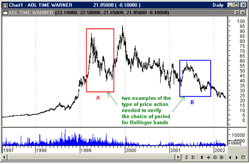
WHICH MOVING AVERAGE?The first rule when using Bollinger Bands is to use a 20-period simple moving average (SMA). With this you will use two standard deviations of the last 20 days. The second rule is to have the SMA act as support and resistance, but only for a correction phase after a high or low. If it turns out that you find a 12-period SMA provides better support and resistance, then use 1.5 standard deviations with the 12-period moving average. The reason? A 12-period moving average follows the data more closely than a 20-period average, and using two standard deviations won't show prices exceeding the bands enough times. For averages between 12 and 20 periods, I use a linear extrapolation — that is, I would use 1.75 standard deviations if I utilized a 16-period moving average. Let's take a look at Figure 1.
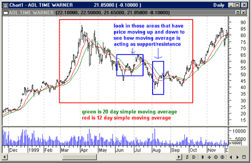
Figure 1: AOL Time Warner, Inc. (AOL) daily price and volume. To find the simple moving average that works best, you need to select a portion of the price history that has a correction following a top or bottom. Either area A or B works, but A is a stronger candidate. After a top or bottom has formed, you want to look for the corrective phases, and areas A and B in Figure 1 are two candidates. Area A is the clear choice. Area B is not as good but has the advantage that it is more recent and may more accurately reflect the rate of change in price. For either area you should focus on how the moving average of your choice acts as support and resistance. To show you the technique, I am going to choose area A. First, I plot both 20- and 12-day moving averages. I then look for those areas where price is reacting and rallying during the downswing, since I am looking at a top correction, and where price turns up again. The two blue areas of Figure 2 where price exceeds the 12-day moving average is in fact a small rally, and when price goes below the 12-day moving average, it is a small reaction. The 20-day moving average lags a little. If you examine area B, you will want to make the same judgments. It is more important to use the correct number of standard deviations with your choice of time period. If in doubt, use a 20-day simple moving average and two standard deviations.
Figure 2: AOL Time Warner, Inc. (AOL) daily price and volume. The same red area from Figure 1 has been expanded, and two areas critical to making a decision are identified in blue. The red 12-day simple moving average does a better job of acting as support and resistance.
Now that you have selected your periods, you can create the upper and lower bands. The next task is to decide what you will use in conjunction with Bollinger Bands.
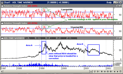
SELECTING AN INDICATORJohn Bollinger himself recommends several indicators to be used in conjunction with Bollinger Bands, starting with RSI, and adding moving average convergence/divergence (MACD), on-balance volume (OBV), and money flow as other possibles. I am going to use RSI, but must illustrate the differences between seven- and 14-period RSIs. I selected a shorter RSI because numerous studies have shown that for any given day, the chance that tomorrow will be an up day or down day is roughly equal. RSI, you will recall, is basically the ratio of price averages of up days divided by price averages of down days. Moreover, the number of consecutive up or down days drops dramatically in terms of the percentage of successive days — that is, four consecutive up days occur far less often than two consecutive up days. So what would you expect if you looked over a 14-day period? You would expect that there would be seven up days and seven down days; that means RSI is going to return a middle value of 50. If an equity is moving sharply up or down, then RSI will reach an extreme of maybe 70 or 30, but you don't really need RSI because it should be clear from the increasing price trend slopes that price is going to exhaust. It's the less dramatic changes in price momentum you want to get a handle on, and looking over seven periods will enable you to see these more clearly. Let's take a look. AOL is a good choice for applying Bollinger Bands, since the stock has experienced significant price volatility. Looking at history (Figure 3), you can get an idea of where you want to use Bollinger Bands. Areas A and B are typical choices, and A shows the kind of volatility especially suitable for Bollinger Bands. However, the price action in area B is more difficult to analyze, so we will look at it in depth.
Figure 3: AOL Time Warner, Inc. (AOL), daily price and volume, with 14- and 7-period RSIs. Two areas, A and B, are typical price patterns for using Bollinger Bands together with another indicator. Area A might be analyzed simply by observing that the trend slopes go up at such a rate that it is only a short matter of time before price will exhaust and retreat. It's more difficult to see how to use an indicator and Bollinger Bands in area B, and so it will be useful for a detailed analysis.
I first used a 12-period Bollinger Band with 1.5 standard deviations, because the 12-period simple moving average did a better job of recognizing small rallies (Figure 4: box inset). A validation of moving average and standard deviation choice is that 5% of the price bars should be outside bands.
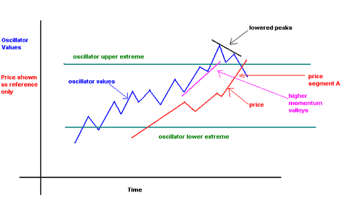
Figure 4: Oscillator behavior.
Next, starting in about mid-April price bars start touching the upper band. These are called upper band walkers. Those bars that touch the lower band are called lower band walkers. John Bollinger refers to them as tags. You want to know when price will pull away from the upper band, because this will likely mean going from a long position to a short one or better yet, closing out your position. To know when this will happen, I will use the RSI as another source of information — the same tool I referred to previously. Before that, however, I am going to give you a quick primer on reading oscillator values, and focus on RSI.
READING OSCILLATOR VALUESOscillators move between extremes. The values that oscillators take between the extremes can be due to behavior changes so small as to be nothing more than noise. Consider: if you are looking at a 14-day RSI, and instead of having seven up and down days, the split is nine up and five down days. Are two extra up days significant in stating that momentum has changed over 14 trading days? Obviously not. But if the oscillator is a ratio, then a 7/7 reading is about half of a 9/5 reading. Between the extremes, you are generally faced with noise. The best compromise in the area between extremes is to either connect the oscillator peaks with a trendline looking for a downtrend, or to connect the valleys with a trendline looking for an uptrend (Figure 4: magenta line). When oscillators push through their extremes, you are now looking to see if the next penetration of the extreme is less than the previous one (Figure 4: black line). In the following discussion I will connect the peaks pushing through the extremes, but only to illustrate that a subsequent peak is lower, since we are looking at price topping action.
USING RSI WITH BOLLINGER BANDSSince RSI has been selected as the indicator to get a signal as to when price will stop tagging the upper band, I am going to see how 14-day and seven-day RSIs perform. For a 14-day RSI, what you observe is that the heights of the two RSI peaks from mid-April to the beginning of May are not much different (Figure 5: blue connecting line on 14-period RSI chart). In fact, as price increases, the next 14-period RSI peak, in the third week in May, is even higher.
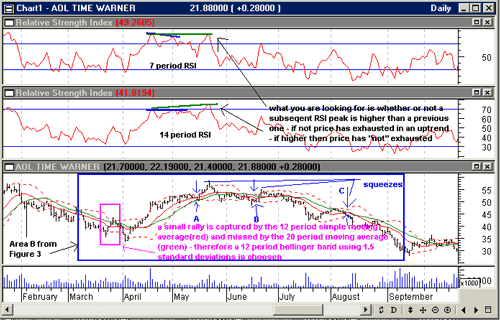
Figure 5: AOL Time Warner, Inc. (AOL), daily price and volume, with 14- and 7-period RSIs. A 12-period simple average (red) is chosen for the Bollinger Bands (dashed red lines at 1.5 standard deviations) because small rallies, such as the one at the end of March (red box), are captured better. As price moves along the upper Bollinger Band, you are looking for divergences with an indicator. In this case, an RSI of seven periods shows two trends that indicate momentum has either leveled out (green line) or decreased (blue line); whereas the 14-period RSI shows either a leveling (blue line) or actual increase in momentum (green line). However, if you look at the seven-period RSI peaks from mid-April to the third week in May, you get a different story. In one case you see a lessening of momentum (Figure 5: blue connecting line on seven-period RSI chart), and the other case is that momentum hasn't changed. Since you are looking for a divergence, then the seven-period RSI will give you the signal (Figure 5: blue trend divergence with price movement) to close your long position at the beginning of May.
SQUEEZESThere are other clues. In Figure 5, I identified the "squeezing" of bands three times. I have mentioned that the presence of squeezes often, but not always, means there is a coming change in price direction. During the squeeze labeled A, price went from a sideways movement to an upswing. At squeeze B, nothing much happened. Squeeze C identified the start, or at the very least the continuation, of a downtrend. Going back to squeeze A, if you had closed your position the correct analysis would be that the squeeze most likely signaled the start of a downtrend. Since prior to taking your position you will wait for a confirmation, you may be surprised to see a rally. But you are looking for a way to short the rally because the momentum just isn't there. You want an RSI peak higher than the one that got you to the current price levels. You need additional momentum to push prices higher, and the level green trendline in the seven-day RSI indicates it isn't going to happen.
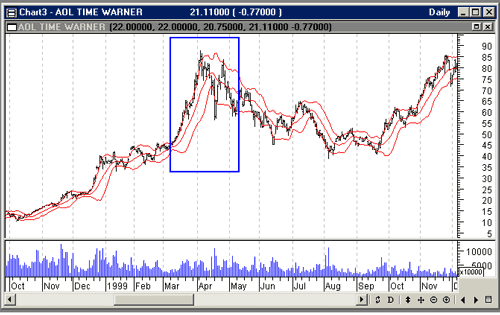
TOPPING CONFIRMATIONWhen a double or triple top or bottom occurs, prices show a distinct pattern relative to Bollinger Bands and are a useful way to confirm a top or bottom. Not all tops or bottoms have this pattern, but without confirmation your risk increases. The pattern for a top is that bars exceed the upper band on the way up and then exceed the lower band on the way down. In area A in Figure 6, you can see that some bars are almost completely above the upper band (left portion of price increases in blue box), and as prices head down, they exceed the lower band.
Figure 6: AOL Time Warner, Inc. (AOL), daily price and volume. Area A of Figure 3 has been magnified, and within the blue box is a price-topping action with a typical price bar versus Bollinger Band pattern for tops (conversely for bottoms). Price bars are almost entirely above the upper band as price exhausts up, and then with the reaction, price bars again are either entirely or almost entirely below the lower band.
This kind of extreme statistical behavior is out of the norm, and the market will always try to return price behavior to normalcy. When price exceeds the upper band and then exceeds the lower band as a reaction, each to the point where bars are either entirely or almost entirely above or below the bands, the pattern is confirmed.
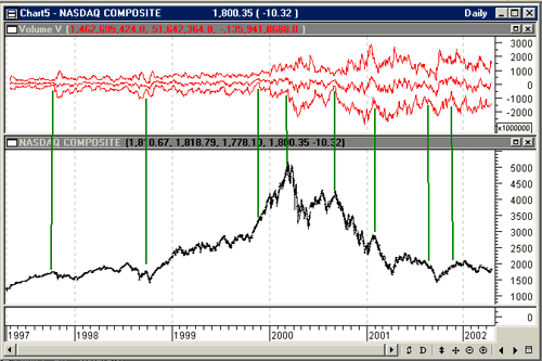
VOLUME VOLATILITYEarlier, I mentioned that there was a relationship between price and volume volatility. An example of this can be seen if you analyze volume behavior for the Nasdaq Composite. I have constructed Bollinger-like bands around the daily difference of Nasdaq up and down volume. I prefer the difference for two reasons: first, it lets me work with slightly smaller numbers, but second (and more important), I want to see when up or down volume dominates. I charted the 12-day exponential moving average of the daily difference as displayed in Figure 7, and then created bands above and below the moving average by using two standard deviations of daily up and down volume difference over the last 12 days. This shows that the market has changed its behavior from prior to 1999. Even with the Russian debt default in 1998, the market has driven volatility to new heights. I have drawn lines from the squeezes in volume volatility to the corresponding price. Charts like this one strongly suggest that volume volatility and price change are coupled.
Figure 7: Daily Nasdaq Composite and Bollinger Bands of volume. The upper chart is constructed using the 12-day exponential moving average of the difference of daily up and down volume, and the two standard deviations of the daily difference of daily up and down volume. Just like price, volume contracts and expands, and the green lines indicate squeezes in volume volatility and how they match up with Nasdaq price behavior.
TRADING RULES
SUMMARYBollinger Bands are used in conjunction with other indicators, and both price and volume volatility have useful trading information. I have used closing price in my examples of price volatility, and weighted close is a useful alternative — (close+close+high+low)/4. When changing from a 20-day simple moving average, don't forget to change the number of standard deviations. I have experimented enough to sometimes bend the rules, as I did in the last example. But if you try doing that yourself, be sure to backtest to gain some confidence that you made the right choice. When using an indicator, make sure you know what it is actually measuring; you don't want to fall victim to noise. And most important, use stops.
Dennis Peterson may be reached at DPeterson@Traders.com. MetaStock (Equis International); eSignal (data)
Current and past articles from Working Money, The Investors' Magazine, can be found at Working-Money.com. |
Market index trading on a daily basis.
| Title: | Staff Writer |
| Company: | Technical Analysis, Inc. |
| Address: | 4757 California Ave SW |
| Seattle, WA 98116-4499 | |
| Phone # for sales: | 206 938 0570 |
| Fax: | 206 938 1307 |
| Website: | working-money.com |
| E-mail address: | dpeterson@traders.com |
Traders' Resource Links | |
| Charting the Stock Market: The Wyckoff Method -- Books | |
| Working-Money.com -- Online Trading Services | |
| Traders.com Advantage -- Online Trading Services | |
| Technical Analysis of Stocks & Commodities -- Publications and Newsletters | |
| Working Money, at Working-Money.com -- Publications and Newsletters | |
| Traders.com Advantage -- Publications and Newsletters | |
| Professional Traders Starter Kit -- Software | |
PRINT THIS ARTICLE

Request Information From Our Sponsors
- StockCharts.com, Inc.
- Candle Patterns
- Candlestick Charting Explained
- Intermarket Technical Analysis
- John Murphy on Chart Analysis
- John Murphy's Chart Pattern Recognition
- John Murphy's Market Message
- MurphyExplainsMarketAnalysis-Intermarket Analysis
- MurphyExplainsMarketAnalysis-Visual Analysis
- StockCharts.com
- Technical Analysis of the Financial Markets
- The Visual Investor
- VectorVest, Inc.
- Executive Premier Workshop
- One-Day Options Course
- OptionsPro
- Retirement Income Workshop
- Sure-Fire Trading Systems (VectorVest, Inc.)
- Trading as a Business Workshop
- VectorVest 7 EOD
- VectorVest 7 RealTime/IntraDay
- VectorVest AutoTester
- VectorVest Educational Services
- VectorVest OnLine
- VectorVest Options Analyzer
- VectorVest ProGraphics v6.0
- VectorVest ProTrader 7
- VectorVest RealTime Derby Tool
- VectorVest Simulator
- VectorVest Variator
- VectorVest Watchdog