HOT TOPICS LIST
- Strategies
- Stocks
- Buy
- Investing
- Brokers
- Psychology
- Interviews
- Accumulate
- Sell
- Hold
- Spotlight
- Websites
- Candlestick Corner
- Gold & Metals
- Options Trading
LIST OF TOPICS
TRADER'S NOTEBOOK
Positive Volume Index
01/07/03 02:04:39 PM PSTby Dennis D. Peterson
Is the primary market trend up or down?
| Writing about the positive volume index (PVI) takes me back to when I first started trying to understand the markets. I joined four stock clubs, searched the Internet extensively, and haunted the local library. I still belong to one of the clubs; its members use fundamentals. Even though they don't subscribe to anything as voodoo-like as technical analysis, they do plot data on semi-log charts and use them as part of the decision-making process. I was also able to learn quite a bit at the library. In addition to Robert Edwards and John Magee's classic Technical Analysis Of Stock Trends, I read Norman G. Fosback's Stock Market Logic. Fosback's book hit me, much the same way the stock club's fundamental orientation contrasted with my technical analysis trading. Fosback didn't see, for example, that there was added gain in going from standard to semi-log charting. The book was not about patterns, or any kind of visual investing techniques, but Fosback's logic is compelling. But if Fosback likes an indicator, you can be sure it is reliable, and he happens to like PVI. In two tables Fosback sums up the performance of two indicators, PVI and its counterpart, the negative volume index (NVI), based on data from 1941 through 1975. He determined that when the trend of NVI is up, there is a 96% probability that we are in a bull market. If the trend of NVI is down, there is a 50% chance we are in bear market. If the trend for PVI is up, then there is a 79% chance we are in a bull market, and if the trend of PVI is down, there is a 67% chance we are in a bear market. Between these two indexes you ought to be able to tell — at least most of the time — whether you are in a bull or bear market. The theory behind the indexes is as follows: On days of increasing volume, you can expect prices to increase, and on days of decreasing volume, you can expect prices to decrease. This goes with the idea of the market being in-gear and out-of-gear (see my article "Volume Speaks Volumes," in September 2001's online Working Money). Both PVI and NVI work in similar fashions: Both are a running cumulative of values, which means you either keep adding or subtracting price rate of change each day to the previous day's sum. In the case of PVI, if today's volume is less than yesterday's, don't add anything; if today's volume is greater, then add today's price rate of change. For NVI, add today's price rate of change only if today's volume is less than yesterday's. Price rate of change can be found by:
(Today's close yesterday's close)/yesterday's close
Both indicators compare the current value to a moving average; for example, the average you might choose by default is 255 days. Although the market of 194175 has changed, the reasoning behind the indicators has not. The theory is really based on human nature, which hasn't changed since the introduction of Homo sapiens.
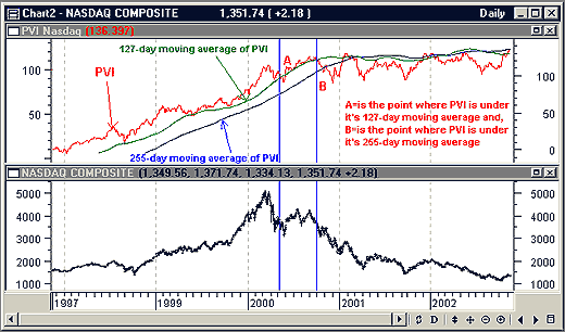
APPLYING ITFigure 1 compares the PVI to a moving average of PVI. This looks at how the PVI itself behaves relative to the trend of PVI, and shows you how it would have been bullish through the first quarter of 2000, using a 127-day moving average, or until October 2000, using a 255-day moving average.
Figure 1: Nasdaq daily price (bottom) and PVI (top). The standard approach is to use a 255-day simple moving average of PVI (blue) and see if PVI (red) is above or below the average. This indicates whether the market is bullish or bearish. A and B identify areas where PVI crossed below a moving average of PVI. However, recent price volatility suggests that a shorter average, such as a 127-day moving average, might work better.
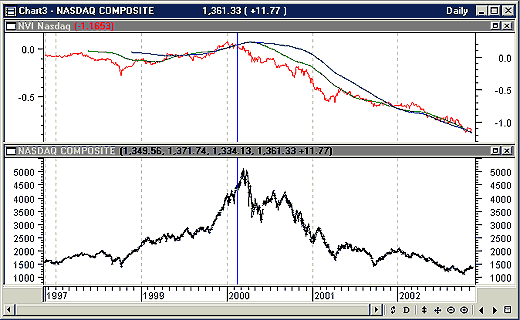
Because of the tools and datafeeds, I am free to do what I want relative to PVI or NVI. Although the Nasdaq Composite is not normally provided with volume, I added the daily up, down, and unchanged volume to have a daily total volume number (courtesy of eSignal and MetaStock). I also used closing prices, although I could have used other combinations, and I used a simple moving average as opposed to an exponential moving average (EMA). After looking at the chart, I think you will agree that Fosback's 194175 observations are still valid once you adjust for the increase in volatility. Now I'll show you how to apply the NVI. Take a look at Figure 2. Looking at the point where NVI went below either the 127- or 255-day moving average of NVI in 2000 (Figure 2: blue vertical line), you can see that NVI gave you a heads-up for exiting long positions on what was an exhausting top of the Nasdaq Composite. This may tempt you to build a trading system based solely on the NVI and its crossing of the moving average of NVI, but note where the NVI is above both averages in 2002, which was not a bullish year for the Nasdaq (or much else). What is clear is that the trend of NVI has been down for most of 2002, and for the same period the long-term trend of PVI has yet to turn positive. By long term, I mean comparing PVI to either a 127- or 255-day moving average.
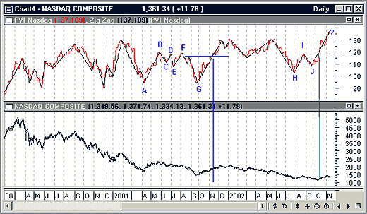
Figure 2: Nasdaq daily price (bottom) and NVI (top). Two moving averages are plotted with NVI, 255 days (blue) and 127 days (green). With either average you are no longer bullish after mid-February 2000. The NVI works well as an exit bull market signal. If you think about PVI or NVI in terms of positive or negative momentum, you may want to consider creating a momentum indicator for each. You can tackle this in a number of ways, such as creating a moving average convergence/divergence (MACD) of PVI. But you are going to run into a problem, which I will explain by using PVI peaks and valleys. I placed a 5% zigzag on PVI (Figure 3) to identify the peaks and valleys. You will see that a higher set of peaks (positive momentum) and a lower set of valleys (negative momentum) occur frequently using a 5% zigzag change. Moreover, some peaks and valleys are larger than others. Smaller peaks and valleys are just noise, and reading noise can be costly. You could increase the percentage of the zigzag, but this will decrease the sensitivity to change and delay the signal. Without sustained momentum you are going to get whipsawed, so what you need to do is just use the "significant" peaks and valleys directly.
Figure 3: Nasdaq daily price (bottom) and PVI (top). PVI has been annotated with a 5% zigzag line (black) to identify peaks and valleys. Valleys A and G are larger in magnitude than C or E. The peaks and valleys identified as H, I, and J are larger in size than C, D, and E, and therefore are more valid. Since J is higher than H it means momentum is gaining, and in October 2002 the horizontal line indicates the ensuing peak, wherever it is, is higher than I.
PEAKS 'N VALLEYSThe best case for PVI showing some strength can be seen in the peaks and valleys of H, I, and J (Figure 3). Why these three? The peaks and valleys of H, I, and J are bigger than those of C, D, and E: they encompass more values of PVI. Note J is higher than H, and the new peak — wherever it might end up — is already higher than the horizontal line that marks the previous peak, I. If you look back at the price action from A through G (Figure 3), you should see an unconvincing case for a sustained move up. True, G nailed the valley in price in late September 2001, but when PVI starts increasing, at what point do you say it has increased enough to sustain price momentum? When PVI peaked in early December 2002, it was no higher than previous recent peaks and started to retreat. This means the market just didn't have the enthusiasm. However, Norman Fosback says that the market loves the holidays: The market doesn't want to be the bad guy at Christmastime. While there is some selling in late December to offset capital loss for the following year's taxes, you have to determine how much gain there has been during the year. This year, many already have sustained enough losses, so relatively little capital-loss selling did not offset the Christmas cheer.
SUMMARYDespite the pundits who are reading an imminent fall in the Nasdaq, PVI and NVI are telling a slightly different story. PVI is showing signs of gaining momentum, which means there is a 79% chance the market is bullish. What you want to see is NVI trending up, which would put that probability in the 96% ballpark; those who prefer long positions should look for down-volume days with positive price increases. An NVI that is trending down suggests there's a 50% chance you are in a bull versus bear market, so it doesn't make a case for either market when used alone. At the moment it looks like the Nasdaq is moving sideways with neither bull nor bear dominating. With a PVI that is gaining momentum, you can expect a positive reaction to good news and for negative news to be discounted.
Dennis D. Peterson may be reached at DPeterson@Traders.com.
SUGGESTED READINGEdwards, Robert D., and John Magee [2001]. Technical Analysis Of Stock Trends, 8th ed., W.H.C. Bassetti, ed. Saint Lucie Press. Fosback, Norman G. [1985]. Stock Market Logic, The Institute for Econometric Research. Peterson, Dennis D. [2001]. "Volume Speaks Volumes," Working Money, September. Charts courtesy of MetaStock (Equis International)
Current and past articles from Working Money, The Investors' Magazine, can be found at Working-Money.com. |
Market index trading on a daily basis.
| Title: | Staff Writer |
| Company: | Technical Analysis, Inc. |
| Address: | 4757 California Ave SW |
| Seattle, WA 98116-4499 | |
| Phone # for sales: | 206 938 0570 |
| Fax: | 206 938 1307 |
| Website: | working-money.com |
| E-mail address: | dpeterson@traders.com |
Traders' Resource Links | |
| Charting the Stock Market: The Wyckoff Method -- Books | |
| Working-Money.com -- Online Trading Services | |
| Traders.com Advantage -- Online Trading Services | |
| Technical Analysis of Stocks & Commodities -- Publications and Newsletters | |
| Working Money, at Working-Money.com -- Publications and Newsletters | |
| Traders.com Advantage -- Publications and Newsletters | |
| Professional Traders Starter Kit -- Software | |
PRINT THIS ARTICLE

Request Information From Our Sponsors
- VectorVest, Inc.
- Executive Premier Workshop
- One-Day Options Course
- OptionsPro
- Retirement Income Workshop
- Sure-Fire Trading Systems (VectorVest, Inc.)
- Trading as a Business Workshop
- VectorVest 7 EOD
- VectorVest 7 RealTime/IntraDay
- VectorVest AutoTester
- VectorVest Educational Services
- VectorVest OnLine
- VectorVest Options Analyzer
- VectorVest ProGraphics v6.0
- VectorVest ProTrader 7
- VectorVest RealTime Derby Tool
- VectorVest Simulator
- VectorVest Variator
- VectorVest Watchdog
- StockCharts.com, Inc.
- Candle Patterns
- Candlestick Charting Explained
- Intermarket Technical Analysis
- John Murphy on Chart Analysis
- John Murphy's Chart Pattern Recognition
- John Murphy's Market Message
- MurphyExplainsMarketAnalysis-Intermarket Analysis
- MurphyExplainsMarketAnalysis-Visual Analysis
- StockCharts.com
- Technical Analysis of the Financial Markets
- The Visual Investor


