HOT TOPICS LIST
- Strategies
- Stocks
- Buy
- Investing
- Brokers
- Psychology
- Interviews
- Accumulate
- Sell
- Hold
- Spotlight
- Websites
- Candlestick Corner
- Gold & Metals
- Options Trading
LIST OF TOPICS
TRADER'S NOTEBOOK
Working In An Exponential World
01/28/03 03:47:10 PM PSTby Brian Bell
Linear or logarithmic?
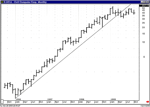
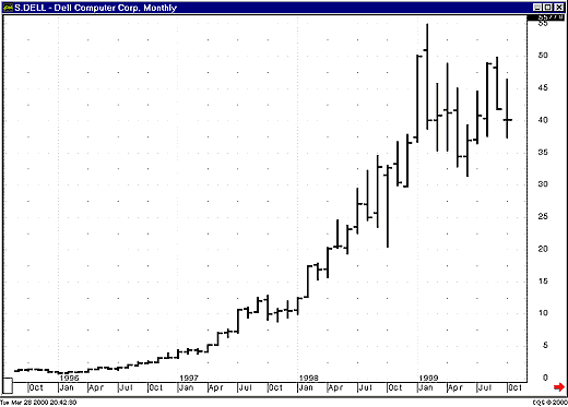
| Figures 1 and 2 both display a monthly chart of Dell from October 1996 to October 1999, yet they appear to be different. Figure 1 shows Dell plotted on a logarithmic scale, whereas Figure 2 uses a linear scale. Note how in Figure 1 you see a clearly defined trendline that begins in January 1996 and finally fails in May 1999. This line can't be drawn on the chart in Figure 2. Using a linear scale, there is no way to tell that the trend has failed.
Figure 1: Dell monthly semilog scale. The trendline that begins in January 1996 continues until its failure in May 1999.
Figure 2: Dell monthly linear scale. This is the same price data as in Figure 1, except on a linear scale. The trendline in Figure 1 cannot be drawn on a linear-scale chart.
It's obvious that simply changing the scale on the chart drastically affects the type and effectiveness of the analysis that can be performed. In this article I will explain what logarithmic scales are, when they should be used, and some of the more subtle implications of using them.
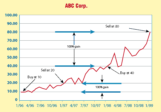
WHAT IS A LOGARITHMIC SCALE?Suppose you invested $1,000 in Abc Corp. stock, buying 100 shares at $10/share. The price then doubles, going to $20/share. You sell the stock and take your profits, realizing a $1,000 gain. A few months later, the stock is at $40/share. You think it looks good, so again you invest $1,000, buying 25 shares. Again the price doubles, this time to $80/share, whereupon you sell your holdings and again pocket $1,000 in profit. Figure 3 shows, on a linear scale, the price at which you bought and sold. Notice how the move from $40 to $80 is four times as large as the move from $10 to $20. You made the same amount on your investment in each case ($1,000), but when you look at the chart you get a sense that you made four times as much.
Figure 3: A linear scale. If you invested $1,000 in ABC Corp. stock at $10/share and sold at $20/share, you made $1,000 or 100% on your investment. If you then reinvested $1,000 at $40/share and sold at $80/share, again you made $1,000 or 100%. The linear-scale chart, however, makes it look like you made four times as much with the second trade as you did with the first.
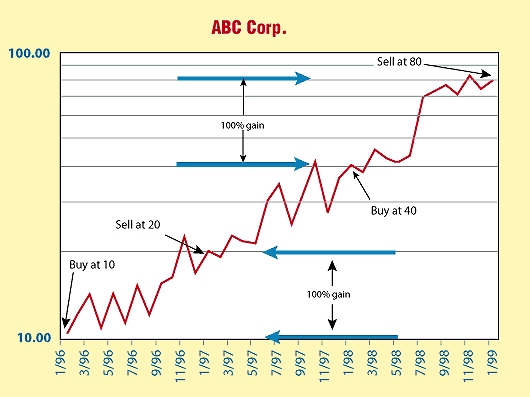
Figure 4 displays the same information plotted on a logarithmic scale. This time, it's apparent that the investment increased by the same amount in each case. Why the difference?
Figure 4: A semilog scale. This chart shows the same investments that were made in Figure 3, except now the prices are plotted on a logarithmic scale. The returns from the two investments appear equal.
To go from any increment on the linear scale to the next higher increment, you must add a constant value. To get to the next higher increment on the logarithmic scale, you must multiply by a constant value. Generally, the value used for the multiplier on logarithmic scales is 10, although it doesn't have to be. You could just as easily use 2 or any other number. Throughout this article, I will use base-10 logarithms. The same principles hold, however, for logarithms of any base.
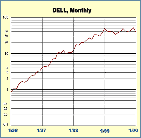
MAKING A SEMI-LOG PLOTHow are prices plotted on a logarithmic (log for short) scale? Although most technical analysis software programs will plot prices on a log scale, it is instructive to do it manually to get a feel for what is happening. To plot the prices on semilog graph paper, first label each major division with numbers that increase by a factor of 10. In Figure 5 I plotted monthly closing prices for Dell from January 1996 through January 2000. I labeled some of the minor divisions for clarity, although in practice this would rarely be done. The lowest major division in this graph is 0.1, since the close in January 1996 is less than 1.0 but greater than 0.1. The highest major division is 100, since the highest closing price to be plotted is greater than 10 and less than 100.
Figure 5: Dell monthly semilog scale
Plotting the values will be easier if you convert the prices from fractional amounts to decimal values before plotting. For values that fall between minor divisions on the graph paper, estimate the location of the point. If the minor divisions are close enough, the points will be very close to where they should be. The major gridlines have been highlighted. Note that these gridlines are placed differently than those in Figure 1, where they correspond to prices that would have major gridlines in the linear-scale chart. In Figure 5, the major gridlines correspond to integral logarithm values. Both methods are correct, but the method shown in Figure 1 makes it easier to tell the actual prices from the chart.
COMPOUNDING MADE LINEARWhen returns from an investment are compounded, the resulting equity curve is an exponential function. The formula for this curve is:
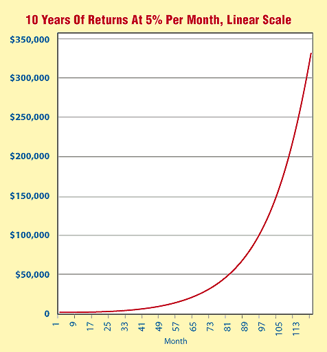
where Vi is the equity after the ith period, V0 is the starting equity, and r is the rate of return for each period. In this formula, the value i is the exponent of a quantity, and thus we get the term exponential function. Using $1,000 as the starting equity and 5% per month as the rate of return, the monthly equity is similar to the one plotted in Figure 6. I have deliberately used an inflated rate of return in order to emphasize the exponential nature of the return on the graph.
Figure 6: Monthly equity linear scale. Starting with $1,000 and an investment that returned 5% per month, this shows the resultant equity curve over a period of 10 years. The equity is an exponential function.
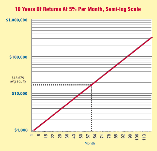
Figure 6 uses a linear scale. What if you plot the equity on a logarithmic scale? The result can be seen in Figure 7. Note that the exponential function on a linear scale becomes a linear function on a logarithmic scale.
Figure 7: Monthly equity, semilog scale. Starting with $10,000 and an investment that returned 5% per month, this shows the resulting equity curve over a period of 10 years plotted on a semilog scale.
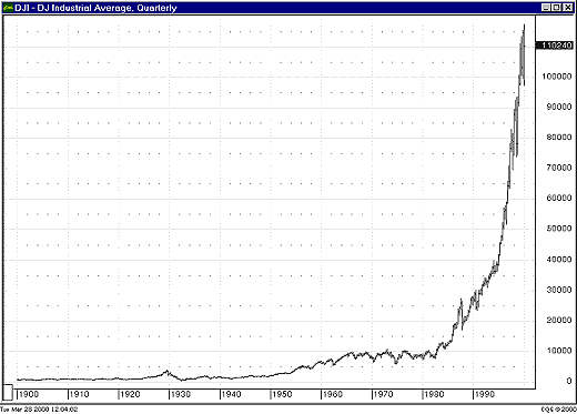
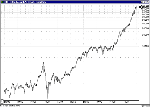
WHEN TO USE LOGARITHMIC SCALESLogarithmic scales can be used whenever the data to be plotted reflects an exponential function or a compounded investment. Stocks fit into this definition, if you assume that a stock is as likely to double from $100 to $200 per share as it is from $10 to $20 per share. Mutual funds and stock market indices are candidates for the use of logarithmic scales as well. The use of a logarithmic scale is only meaningful when the price range of the plot is fairly large. A logarithmic plot of prices that only covers the range of 100 to 110 is going to be nearly identical to the linear plot. It is also important to use a logarithmic scale when looking at long-term stock index charts. The quarterly bar chart of the Dow Jones Industrial Average (DJIA) from 1900 to the present (Figure 8) is not very interesting when examined on a linear scale, but lots of interesting features can be seen when viewed on a log scale (Figure 9).
Figure 8: DJIA quarterly, linear scale. Due to the large range of values represented, it is difficult to extract useful information from this chart.
Figure 9: DJIA quarterly, semilog scale. It is now much easier to discern certain features. The bull market of the 1920s followed by the Great Depression, and the bull market that lasted from the early 1940s to the mid-1960s (and the nearly 20-year long consolidation that followed), were not nearly so apparent on a linear scale.
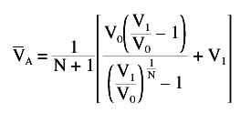
INDICATORS AND LOGARITHMIC PLOTSHow does the use of a log scale affect the calculation of indicators? Unfortunately, most, if not all, technical analysis software programs make no distinction in their calculations. Examine Figure 6 again. What is the average equity VA over the range of the graph? Without going through the derivation, the formula for the average equity over the term is:
Given V0=1000, V1=$348,912, and N=120, the average equity VA during this time was $60,389. Can the log-scale plot be used to calculate the average equity? From Figure 7, you can easily determine the average equity graphically. Since the equity curve is a straight line, the average equity is found by simply drawing a horizontal line from the midpoint of the curve over to the vertical scale and reading the value. The values plotted in Figure 7 are the logarithms of the monthly equity values, so this can be expressed as:
which gives:
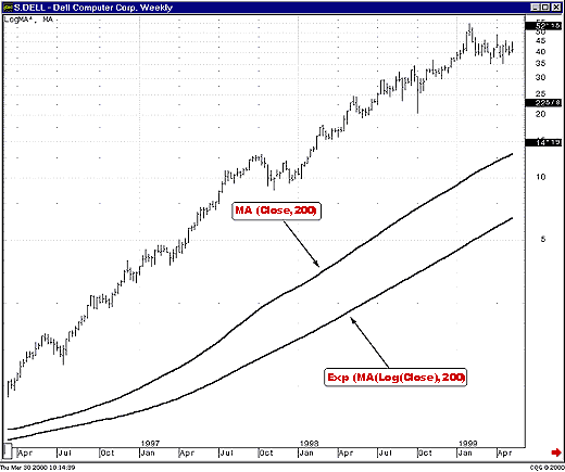
Given the same values as used above, the average equity VG is now calculated to be $18,679, which is significantly different from the result above. Which value is correct? They both are; they are simply different types of averages, the arithmetic mean and the geometric mean. The value to use depends on the type of problem and in which domain, linear or logarithmic, you will analyze it. If the underlying process is assumed to be exponential in nature, then the geometric mean is probably the better choice. Otherwise, use the arithmetic mean. The important point to note is this: calculations will give different results when performed in the linear domain than they will in the exponential domain. Why is this important? Examine Figure 10, which shows the same weekly chart of Dell you saw earlier. Two sets of indicators are plotted on this chart. They are both 200-bar simple moving averages. One was calculated on actual prices, then plotted on the log-scale chart (this would be the arithmetic mean). The other, the geometric mean, was calculated in the exponential domain, using this formula:
Figure 10: Dell weekly, semilog scale. This chart shows two 200-bar simple moving averages. One is calculated on prices, then plotted on a logarithmic scale. The other is calculated on logarithms of prices, then converted back into the price domain before being plotted.
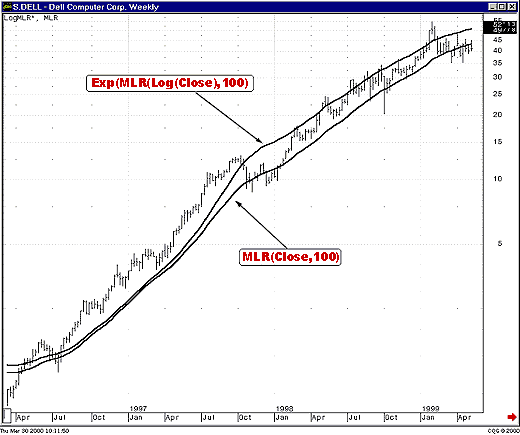
First the average of the logarithms of prices is calculated. Then the exponential of that value is used as the value of the moving average on the chart. Note how far apart the two indicators are. The longer the period of the moving average, the farther apart they will be. Figure 11 shows another example. In this case, there are two moving linear regression studies, both with periods of 100. Again, one was calculated on closing prices and then plotted on the logarithmic scale, while the other was calculated on logs of prices and then converted back to chart values.
Figure 11: Dell weekly, semilog scale. Two moving linear-regression studies are shown. One is calculated on the logarithms of prices, while the other is calculated on prices themselves.
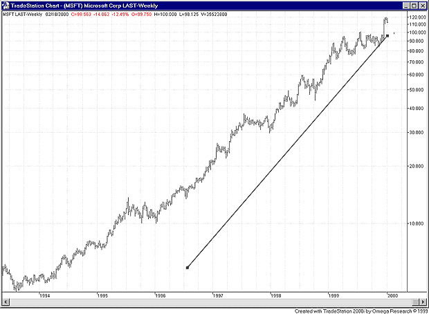
Which studies should you use on charts — the conventional studies, or the ones calculated in the exponential domain? When using shorter periods, the studies give similar values, and I usually don't bother with creating special studies that calculate in the exponential domain. There is one case, though, in which I have found it to matter a great deal. When dealing with linear regression lines, it is crucial that the calculation be done using logs of prices and then be converted back using the exponential functions. Otherwise, you may end up with something similar to what you see in Figure 12. Some technical analysis packages do this correctly; some don't. Just be aware of the issue, so that if you see a very strange linear regression line on a long-term stock chart you won't spend hours trying to get an explanation from customer service (as I did!).
Figure 12: MSFT, weekly, semilog scale. This chart shows the effect of calculating a regression line on prices, then displaying it on a logarithmic scale.
SUMMARYLog-scale charts can be very helpful, especially when using long-term stock charts. Stocks often act like compound return investments, having an exponential growth curve. Any instrument with an exponential growth curve can be plotted on a semilog graph, converting the growth curve to a straight line. This line can be more easily analyzed for trends than the exponential curve. When using log-scale charts with technical analysis software packages, traders should be aware that indicators and regression lines may still be calculated on raw price data. This will affect the appearance and location of the indicators.
Brian Bell is the president of Custom Trading Solutions, a consulting firm based in Littleton, CO. He may be reached at 303 730-3388 or via his website at www.customtradingsolutions.com. Charts courtesy of CQG, Inc.
Current and past articles from Working Money, The Investors' Magazine, can be found at Working-Money.com.
SIDEBAR 1: WHAT IS A LOGARITHM? Given the definition loga(b)=x (read "the base-a logarithm of b is x"), this is the same as saying that b=ax. Two common bases are used for logarithms (logs for short), although any number can be used as a base. The two common bases are 10 and an irrational number named e, which is approximately equal to 2.71828. Base-e logarithms are called natural logarithms. The notation ln(x) is used to indicate natural logarithms, while the notation log10(x) indicates base-10 logs. Less often you may see the notation log(x) used to indicate base-10 logs, although that notation is also sometimes used to indicate natural logs. Throughout this article I use natural logarithms, except when plotting data, when I use base-10 logarithms. B.B.
SIDEBAR 2: CQG FORMULAS The CQG formulas for the logarithmically calculated indicators are:
Moving average: Exponential(MA(NatLog(@), Sim, 200))
Moving linear regression: Exponential( MLR( NatLog(@), 100)) B.B.
|
| Website: | www.customtradingsolutions.com |
PRINT THIS ARTICLE

Request Information From Our Sponsors
- StockCharts.com, Inc.
- Candle Patterns
- Candlestick Charting Explained
- Intermarket Technical Analysis
- John Murphy on Chart Analysis
- John Murphy's Chart Pattern Recognition
- John Murphy's Market Message
- MurphyExplainsMarketAnalysis-Intermarket Analysis
- MurphyExplainsMarketAnalysis-Visual Analysis
- StockCharts.com
- Technical Analysis of the Financial Markets
- The Visual Investor
- VectorVest, Inc.
- Executive Premier Workshop
- One-Day Options Course
- OptionsPro
- Retirement Income Workshop
- Sure-Fire Trading Systems (VectorVest, Inc.)
- Trading as a Business Workshop
- VectorVest 7 EOD
- VectorVest 7 RealTime/IntraDay
- VectorVest AutoTester
- VectorVest Educational Services
- VectorVest OnLine
- VectorVest Options Analyzer
- VectorVest ProGraphics v6.0
- VectorVest ProTrader 7
- VectorVest RealTime Derby Tool
- VectorVest Simulator
- VectorVest Variator
- VectorVest Watchdog

