

HOT TOPICS LIST
- Strategies
- Stocks
- Buy
- Investing
- Brokers
- Psychology
- Interviews
- Accumulate
- Sell
- Hold
- Spotlight
- Websites
- Candlestick Corner
- Gold & Metals
- Options Trading
LIST OF TOPICS
TRADER'S NOTEBOOK
When The Market Speaks, It Pays To Listen
04/29/03 10:27:08 AM PSTby Mike Hurley
Why care about market internals?
| While studies vary on the exact figure, it's safe to say that the majority of stocks follow the market. After all, that's why they invented market averages and indexes in the first place. Whether you want to believe it or not, this simple (and often ignored) market truism affects us all. As a result, I believe a "top-down" approach to the markets is critical for investors and traders alike. The good news is that none of us need spend an excessive amount of time and energy on this aspect of our analysis. One option is simple trend analysis on either daily (or weekly) charts with such questions as: "Is the market trending? Is the market consolidating? What are some key support and resistance levels that might make me change my mind?" There are of course some widely used technical tools available, two of the more popular being the moving average convergence/divergence (MACD) and the average directional movement (ADX), popularized by Gerald Appel and J. Welles Wilder, respectively. For those willing to roll their sleeves, just a little effort can lead to a wealth of information about the health of the overall market. Much like a doctor who monitors a patient's pulse and blood pressure, a savvy technician can glean a great deal of insight from observing trends in breadth and leadership. Put simply, market internals offer a direct way of measuring how the stock market is really doing. ART OR SCIENCE? It's not widely known that a great deal of quantitative work has been done in this area, in large part due to the availability of hard data with which to build models. Norman Fosback's high-low logic index is a good example, while Gerald Appel has conceived numerous valuable indicators in this area. While rules and systems are a must for many individuals, the market rarely cooperates by flashing the perfect signal at just the right time. In fact, it seems that no two tops or bottoms are exactly alike, and while clearly more subjective, actually analyzing the data qualitatively often leads to more profitable results.
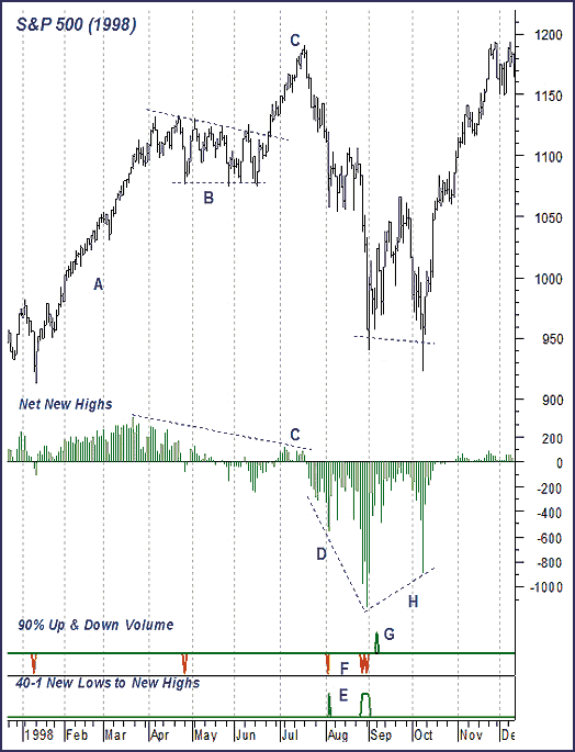
A FEW EXAMPLESThe 1998 market (Figure 1) provides a good example of how to use market internals. After a strong move early in the year (A), stocks consolidated their gains in the spring (B). The breakout in June looked great until mid-July, when things began to deteriorate technically. Specifically, as the Standard & Poor's 500 was scoring new all-time highs, the number of stocks scoring new 52-week highs was falling woefully short of what had been seen in the FebruaryMarch time frame. This formed a major divergence at point (C). Specifically, net new highs were lower than in March, giving a huge warning that the rally might be in trouble.
Figure 1: Using market internals. Market internals often form meaningful divergences with the indexes at major market turning points.
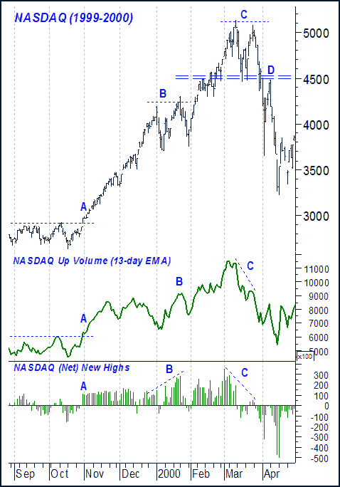
While obviously a valuable piece of information, this also highlights the lack of specificity, which can be a problem for many traders and investors. After all, where exactly is the signal, and what should you do when these divergences appear? Scale back your long exposure as the Standard & Poor's 500 approaches the round number of 1,200? Tighten stops on existing longs? Short the market if it begins to stall? Well yes! Choose whichever strategy fits your individual style, risk tolerance, and trading plan. The critical point is that market internals were clearly not in gear with the rally, and were shouting a warning to those willing to listen. As stocks declined through July and August, leadership continued to deteriorate. In classic fashion, each time the number of net new lows scored a lower low, it was a sign of further weakness ahead for the market averages (D). New lows exceed new highs by 40 to 1 on several occasions (E), which often indicates market bottoms. Using this indicator as a mechanical system would have clearly been a mistake, however, as it gave a buy signal for the S&P at 1,081 — just in time for the next leg down! Panic selling (down volume making up at least 90% of up and down volume combined) occurred three times in August (F), with panic buying on September 8 (G). While this pattern is usually seen at bottoms, it is often better to wait for internals to diverge before diving back into the market. Leadership did in fact trace out a higher low in October (H), offering a much better entry point from a risk-management point of view. While it's certainly possible to catch falling knives, it's much safer to wait for them to hit the ground before grabbing at them! Another great example of how important it is to look behind the scenes is with the market of 19992000 (Figure 2). First, while few even noticed the Nasdaq's powerful surge through the 3,000 mark in November (A), even fewer thought it would amount to anything given the worries about Y2K. Breadth and leadership clearly confirmed the move, however, surging to new highs of their own (A). This made the Nasdaq a screaming buy to the few who happened to be paying attention.
Figure 2: Could you have seen a bursting of the bubble? Market internals on the Nasdaq remained strong through January of 2000 (B), but then diverged dramatically in March (C).
January then saw many well-known chartists highlight, and caution about, a major double top in the Nasdaq. Market internals remained strong, however, suggesting stocks were still in good shape (B). In March, though, it was a very different story. Specifically, the first run at 5,000 in the Nasdaq showed nearly 400 net new highs, while the second could muster only 50. Up volume was also quite weak, forming major divergences on the charts (C). While no one knew precisely what lay ahead for the Nasdaq, these dramatic divergences told all to at least be very careful, and to take any break of support in the 4,500 area seriously. Those who play the short side would have found an ideal entry at (D) as the Nasdaq made a classic dead-cat bounce and then failed at what had been critical support.
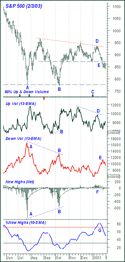
THE CURRENT MARKETThese historical examples beg the question: What is the market telling us now? While things are never as obvious as in hindsight, let's go through how things look as of February 3, 2003. Let's start with summer 2002 (Figure 3), when stocks set a "panic-type" low in July (A). Specifically, July saw a parabolic climax to the decline accompanied by heavy down volume over 800 net 52-week lows and a spike in the volatility index (VIX) to over 55 (not shown). At first glance, the autumn smash looks even worse than that of the summer, taking the S&P 500 to new lows on a closing, as well as intraday, basis (B).
Figure 3: The current market. At point E, things don't look so good for those who expected to see a rally. The S&P 500 broke below the 870 area, down volume is increasing, and number of net new highs doesn't show any signs of moving significantly into positive territory.
Looking behind the scenes, however, we see that the selling in October was actually less aggressive than that seen in July, as measured by down volume and new 52-week lows. Both formed bullish divergences with the index; these (as shown in the previous examples) are among the most powerful signals the market can give. While the key is to watch for major divergences in the indicators that are supporting the market's current trend (meaning a break in down volume during a decline, or new highs during an advance), the slight divergence in up volume at (B) serves as further confirmation that stocks did indeed find meaningful buying as the S&P approached the July lows. Stocks surged dramatically off support and continued to rally through November. Internals were "in gear" and flashed no major warning signs. Critical support in the 870 area survived a test in late December, and the first trading day in January finally saw a 90% up volume day (C). Even with this, up volume fell woefully short of that seen in November as the S&P approached important resistance in the 950 area (D). Things deteriorated further, as the market slipped through the key 870 area (E). Down volume rose, as expected, while leadership (which never really got going) rolled over as well (F). In fact, when measuring the number of new 52-week highs as a percentage of total new highs and lows (another indicator popularized by Gerald Appel), it was clear that this indicator flashed a sell signal by slipping through the key 70% mark (G). All in all, this was not an encouraging action for the bulls. A close back above 870, of course, would have improved the situation, while one below 840 would have confirmed the market was most likely headed for a test of the fall lows in the 775 to 800 area. While the break in leadership at (G) is important in its own right, it also (like the 40:1 ratio in the first example) highlights the difficulty in using any indicator as a holy grail. In this case, we can see that the indicator flashed a buy signal on August 19 when it crossed back above 30. As fate would have it, this signal came within three days and 15 points of the August top. This situation was compounded when the indicator headed south prior to making it back above 70%, leaving us high and dry, as it has no ability to register a sell signal. Stocks suffered nearly a 20% decline from that point as they tested the October lows, and there was of course no guarantee they would hold.
EARNING YOUR MONEYFinally, there is a legitimate concern that the recent increase in the number of nonoperating companies (such as bond funds and closed-end funds) may be distorting both the market averages as well as the internal measurements we have been discussing. While I am not aware of any widely published studies that address this issue, I have heard isolated examples of people trying to construct indicators that sidestep this issue, such as an advance-decline line of stocks exclusive to the S&P 100. While this would indeed be a more pure indicator, I am not sure it would lead to any material improvement in our analysis. Take, for example, the 1998 top in the S&P. While we may have seen an influx in the number of nonoperating companies on the New York Stock Exchange (NYSE) over those few months, I doubt that their numbers were such that they were responsible for creating the divergence in the number of new highs reported. This is, however, another good case for qualitative analysis, and for getting into the actual data and seeing the divergence. The NYSE appears responsive to the issue, and has recently rebalanced the NYSE index (NYA). Only time will tell if the exchange will make additional changes to the way they report market activity. (See sidebar, "Indicator key," for examples shown in this article.) The bottom line for now is, whether you trade or invest in individual stocks or market-based vehicles such as exchange-traded funds or mutual funds, the very first step in your analysis should be a look at the overall market. Put simply, when the market speaks, it pays to listen.
Mike Hurley is a chartered market technician and 20-year market veteran. He has served as a technical analyst for Preferred Capital Markets, E*OFFERING, and SoundView Technology Group, as well as publisher of the Sector Fund Timer. He can be reached at mikehurley@sbcglobal.net.
RELATED READINGAppel, Gerald [1985]. The Moving Average Convergence-Divergence Trading Method, Advanced Version, Scientific Investment Systems.Fosback, Norman G. [1985]. Stock Market Logic, The Institute for Econometric Research. Wilder, J. Welles [1978]. New Concepts in Technical Trading Systems, Trend Research. Metastock (Equis International, Inc.)
Current and past articles from Working Money, The Investors' Magazine, can be found at Working-Money.com.
SIDEBAR Indicator key The following is a key to the indicators shown in the article examples:
|
| E-mail address: | mikehurley@sbcglobal.net |
PRINT THIS ARTICLE

Request Information From Our Sponsors
- StockCharts.com, Inc.
- Candle Patterns
- Candlestick Charting Explained
- Intermarket Technical Analysis
- John Murphy on Chart Analysis
- John Murphy's Chart Pattern Recognition
- John Murphy's Market Message
- MurphyExplainsMarketAnalysis-Intermarket Analysis
- MurphyExplainsMarketAnalysis-Visual Analysis
- StockCharts.com
- Technical Analysis of the Financial Markets
- The Visual Investor
- VectorVest, Inc.
- Executive Premier Workshop
- One-Day Options Course
- OptionsPro
- Retirement Income Workshop
- Sure-Fire Trading Systems (VectorVest, Inc.)
- Trading as a Business Workshop
- VectorVest 7 EOD
- VectorVest 7 RealTime/IntraDay
- VectorVest AutoTester
- VectorVest Educational Services
- VectorVest OnLine
- VectorVest Options Analyzer
- VectorVest ProGraphics v6.0
- VectorVest ProTrader 7
- VectorVest RealTime Derby Tool
- VectorVest Simulator
- VectorVest Variator
- VectorVest Watchdog