HOT TOPICS LIST
- Strategies
- Stocks
- Buy
- Investing
- Brokers
- Psychology
- Interviews
- Accumulate
- Sell
- Hold
- Spotlight
- Websites
- Candlestick Corner
- Gold & Metals
- Options Trading
LIST OF TOPICS
THE CHARTIST
Volume-Weighted Moving Averages And The P&F
01/28/04 03:38:16 PM PSTby Paul Fell
When crossovers and Xs together mark the spot.
| Point and figure (P&F) is one of the oldest charting techniques around. Today, many variations of this popular technique are available, including such recent developments as the overlay of volume histograms. Another recent development is the introduction of moving averages. Here's a method for deriving a volume-weighted moving average for P&F charts, based on a statistical approach. In addition, it compares moving average crossovers with trendline breaches as a method with which to produce trading signals.
THE POINT & FIGURE CHARTSeveral features of the P&F chart make it distinct from other chart types. First of all, a P&F chart consists of alternating columns of Xs and Os. Xs represent rising prices, while Os represent falling prices. The chart consists of a grid where each box represents a degree of price movement. Thus, point and figure charts display the underlying supply and demand that drives price changes. When there is a reversal — that is, when prices stop going up or down and head in the opposite direction — P&F charts switch to a new column (from Xs to Os or vice versa). The reversal is set to a specific degree that determines how sensitive the P&F chart will be. If each box in the grid represents a change of one point, then it will show more detail and respond more dramatically than a P&F chart in which each box represents two points, or three, or five. The x axis commonly shows the date when the column was started. However, the x axis is not time-dependent: New columns are not determined by time, but by supply and demand. Essentially, a P&F chart is a series of prices where boxes, coupled with number of reversals, are used to filter out noise. This is the feature that makes this charting technique so attractive to investors and traders.
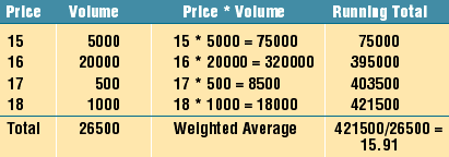
THE VOLUME-WEIGHTED MOVING AVERAGETo compute a moving average for the P&F chart, we first need to arrive at a summary price (statistic) for each column. Do we simply take the midpoint, or is there a more statistically sound way of deriving this value? Within a P&F column there may be many price movements. Each price will always have a volume associated with it, and this is the key to the calculation. Let's look at an example to see how volume may be used to compute an overall column price or average. Figure 1 shows actual prices, not boxes; these prices form the basis of the bull column. Further, let's assume that the box size is $1 and that price rises from $15 to $18.
Figure 1: Using volume to compute the column price or average.
Although price is rising, you can see that volumes are low at the higher prices, so we may wish to be wary of future developments. To arrive at an average, we could take the midpoint in the column as our column average — that is:
(15 + 16 + 17 + 18) / 4 = 16.5
The problem is, we have just seen that volume is not supporting the higher prices, yet we are essentially giving the same weight to each price. A more meaningful and statistically correct average would be one weighted by volume. More emphasis will be placed on prices with higher volumes, and less emphasis on prices with lower volumes. Here is a generalized formula for calculating a weighted average:
Figure 2 shows the calculation of the weighted average for the column.
Figure 2: Calculating volume-weighted average.
Now compare the weighted average of $15.91 with the average of $16.50. The new, volume-weighted column statistic better represents the underlying market sentiment. This weighted average is an important component in the computation of moving averages in P&F charts.
DERIVING THE MOVING AVERAGENow that we have a price summary, we can chart a moving average in the same way we chart moving averages for more traditional charts. By using the weighted average for each column with the simple moving average methodology, we are automatically creating the volume-weighted moving average. It is also possible to use the exponential moving average (EMA). On traditional charts, the EMA places more weight on recent prices. In a similar way, an EMA on a P&F chart applies more weight to recent columns. The formula for calculating the EMA of the P&F chart is:
EMAc = EMAp * (1 K) + (ColumnWA * K)
where : Choosing fewer columns will apply greater weight to recent prices.
OVERLAYING THE MOVING AVERAGESince a P&F chart is based on a grid, a logical place to locate each value of the moving average is the center of gravity of the box in which the moving average falls. However, it could also be charted at the top or bottom of the box, because although the moving average is derived from the P&F chart, it is the comparison of two moving averages (that is, the crossovers) that we are interested in. The important point is that the placement of the moving average values should be consistent.
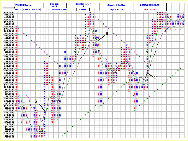
SOME EXAMPLESFigure 3, the chart of International Business Machines (IBM), displays two EMAs. EMA1 (green) is five columns and EMA2 (purple) is 10 columns. Note the bullish and bearish trendlines (+). The moving average crossovers A and C provide us with our buy signal. If we followed the traditional trendline break approach, we would be waiting until the bearish trendline was breached. In both cases this never happened, and had we waited for it, we would have missed our opportunity. Is the EMA crossover a more accurate signal for a change in trend than the traditional trendline break? Look at crossover B. Our exit point is provided, and it comes much earlier than the penetration of the bullish trendline. This crossover would enable us to take profits as opposed to potential losses (had we stayed on for the ride down to the bearish trendline).
Figure 3: IBM using closing prices; box size 0.25; three reversals and no vertical scaling; and an EMA based on five and 10 columns.
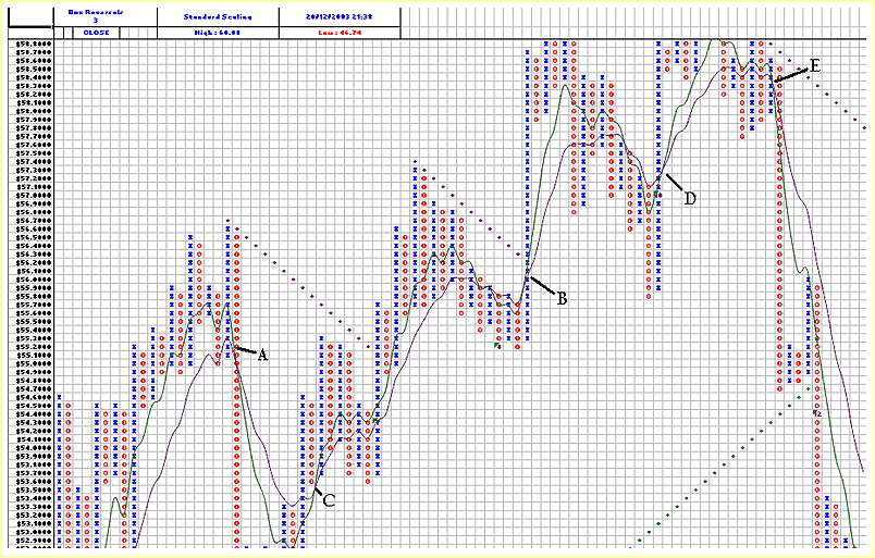
The next example, the chart of Wal-Mart (WMT) in Figure 4, clearly shows the advantage of using EMA crossovers in comparison to trendlines. Let's take the buy signals first. EMA crossover C gets you in well before the bearish trendline is breached seven columns later. It also gets you in at a lower price. For those who waited, EMA crossover B occurs just prior to the breach of the bearish trendline, and EMA crossover D occurs before the column of Xs gets anywhere close to the bearish trendline (just off the graph).
Figure 4: Wal-Mart using closing prices; box size 0.1; no vertical scaling; and an EMA based on five and 10 columns.
As we look at sell signals, crossover E emphatically outperforms the trendline breach that occurs five columns later. In addition, although the trendline does not appear in the figure, crossover A also outperforms the trendline breach.
CONCLUSIONIn my experience, intervals based on five and 10 columns are the most reliable. However, this is subjective; you may wish to try some variations. Moving averages are a relevant and useful indicator for P&F charts, providing they use weighted column averages. Trendlines cannot always determine exit points, particularly for shorter-term fluctuations in trend, whereas moving averages can do so reliably.
Paul Fell is general manager of an Australian software house that develops financial add-in applications for Excel such as XLChartPro, a point & figure charting package. He has contributed articles to Asia's ChartPoint magazine, GuppyTraders.com, and the Australian Technical Analysts Association Journal. He may be reached at paul@xlchartpro.iinet.net.au.
Charts courtesy of XLChartPro Current and past articles from Working Money, The Investors' Magazine, can be found at Working-Money.com. |
| E-mail address: | paul@xlchartpro.iinet.net.au |
PRINT THIS ARTICLE

Request Information From Our Sponsors
- VectorVest, Inc.
- Executive Premier Workshop
- One-Day Options Course
- OptionsPro
- Retirement Income Workshop
- Sure-Fire Trading Systems (VectorVest, Inc.)
- Trading as a Business Workshop
- VectorVest 7 EOD
- VectorVest 7 RealTime/IntraDay
- VectorVest AutoTester
- VectorVest Educational Services
- VectorVest OnLine
- VectorVest Options Analyzer
- VectorVest ProGraphics v6.0
- VectorVest ProTrader 7
- VectorVest RealTime Derby Tool
- VectorVest Simulator
- VectorVest Variator
- VectorVest Watchdog
- StockCharts.com, Inc.
- Candle Patterns
- Candlestick Charting Explained
- Intermarket Technical Analysis
- John Murphy on Chart Analysis
- John Murphy's Chart Pattern Recognition
- John Murphy's Market Message
- MurphyExplainsMarketAnalysis-Intermarket Analysis
- MurphyExplainsMarketAnalysis-Visual Analysis
- StockCharts.com
- Technical Analysis of the Financial Markets
- The Visual Investor


