HOT TOPICS LIST
- Strategies
- Stocks
- Buy
- Investing
- Brokers
- Psychology
- Interviews
- Accumulate
- Sell
- Hold
- Spotlight
- Websites
- Candlestick Corner
- Gold & Metals
- Options Trading
LIST OF TOPICS
FOCUS ON
Sector Spotting
01/28/04 03:20:07 PM PSTby David Penn
Strength in semiconductor and box maker indexes may point toward opportunities in a number of stocks.
| Author, trader, and trader educator David Nassar has this to say about the importance of sectors and sector rotation when it comes to playing stocks:
Sectors [that] are strong gain the attention of institutional money, traders, and — yes! — the amateur crowd. When the semiconductors are strong, I trade them. When money is flowing from one sector to another, I trade both. The fleeting sector is shorted while the recipient sector of money flow is traded long. This, by the way, is what true hedge funds do . . . Hedge funds will trade both sides of the market while limiting overall portfolio risk by constantly being hedged. They make their money by taking sector risk, while eliminating market risk. Whether or not an individual trader wants to mimic the trading behavior of hedge funds, there is much to appreciate in Nassar's suggestion that following sectors is a way to win in the markets. One of the biggest challenges many beginning stock traders have is figuring out a way to determine, out of a universe of thousands of stocks, which stocks to pay attention to and why. Not a few of the questions I get from readers are queries about stock-screening products, websites, and methods — which testifies to the number of traders facing this problem. While there are many excellent stock-screening products and websites out there (a few have been reviewed in Technical Analysis of STOCKS & COMMODITIES), one of the more basic and straightforward ways to narrow down the stock universe is by studying sectors. The rise of exchange-traded funds (ETFs) has made it easier for individual traders and investors to learn what various sector "galaxies" make up the equity "universe." You can find out more about exchange-traded funds from websites like the American Stock Exchange's Amex.com, as well as iShares.com, which has information about the exchange-traded funds from Barclays Global Investments. Another helpful source for sector listings is the Chicago Board Options Exchange (CBOE), which provides information about sector-based options — most of which can be charted as if they were indexes. Once a trader finds a sector that appears to be ready to move, all he or she need do is to "drill down" into that sector for the stocks that look most likely to take advantage of the move in the broader market. If it looks like $HGX, an index of housing construction stocks, is ready to break out, then study component stocks like Lennar (LEN), Toll Brothers (TOL), and others in order to determine which stock might make the most of the ensuing move. Assuming a trader uses reliable indicators and oscillators and uses them properly, then the discipline to approach each market, each sector, and each stock with the same technical tools is to a degree more important for the average retail trader or investor than the actual technical tools used. Moving averages or trendlines? Relative strength index or rate of change? It is far more important to develop a reliable and consistent approach to the market than it is to spend hours tweaking and optimizing exotic indicators and oscillators.
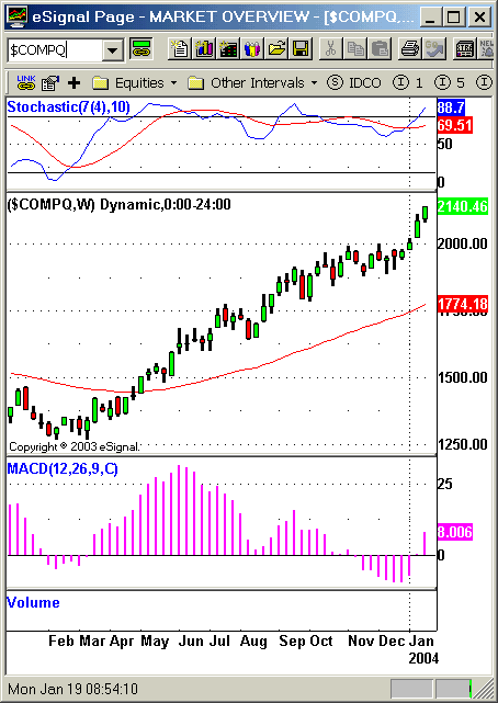
TOOLS FOR SECTOR ANALYSISThe trio of a 50-period exponential moving average (see Charles B. Schaap's excellent article "The 50-50 Strategy" in Working Money for a primer on the use of this moving average), the MACD histogram, and the stochastic oscillator (7, 10) is the set of tools I personally have been using recently to analyze and study both sectors and stocks. This approach is derived largely from Alexander Elder's "triple-screen" method (see his book Trading For A Living), though there are a few differences. In a generally rising trend — as defined by an upward-sloping moving average — I look for instances when a declining MACD histogram bottoms and ticks up. Often this is an excellent opportunity to enter a market on the long side, especially when using weekly data. For example, looking at the Nasdaq, there was a great "go-long" signal back in February 2003. Note how the MACD histogram declined from a peak in late December 2002, fell below the zero line in late January 2003, and, as February began, ticked upward. This was a sign that the market was likely moving higher. Even as it remained below the 50-period (here, the period is "week," hence, 50 weeks) moving average, this "ticking higher" in the MACD histogram suggested that a low might have been established. What the trader or investor is looking for at this point is follow-through to the upside, preferably a price above the high of the "tick-up" day. When that occurs, the likelihood of further price moves in that direction increases significantly. But what if you aren't interested in trading the Nasdaq as a whole? If the Nasdaq may be about to reverse to the upside, it may be profitable to see which sectors are similarly moving upward. More than a few market analysts have observed that semiconductor stocks often lead the broader market upward in bull markets and are among the first stocks to break when the bull market is about to slip into a correction. Thus, for me, one of the first places to look for sector strength is in semiconductors. Whether you prefer to use the $SOX (the Philadelphia semiconductor index) or the SMH (the semiconductor HOLDRS exchange-traded fund), weekly charts of both point to the same opportunities that were seen on the weekly chart of the Nasdaq, as seen in Figure 1.
Figure 1: Weekly Nasdaq. The weekly MACD histogram's lows in February 2003 signaled a major buying opportunity for Nasdaq stocks. Nearly a year later, it is obvious that a bullish decision on the Nasdaq in general and the semiconductors in specific would have been a good decision indeed. So let's take a look at a more recent potential long opportunity to see how well this general methodology holds up.
FROM THE NASDAQ TO NATIONAL SEMICONDUCTORLooking at the weekly chart of the Nasdaq, we can see that the 50-period exponential moving average has been in a gentle upswing since spring 2003. If we shift our attention to the MACD histogram, we can see that in December, the histogram ticked into negative territory, a downswing that began after the weekly MACD histogram peaked in mid-September. Note that the Nasdaq continued to rise while the MACD histogram declined. This goes back to the notion of using indicators properly. Just because the histogram has peaked and begun moving down does not in and of itself mean it is time to sell — far from it. As long as the trend remains upward, then the falling histogram simply notes there is some loss of upward momentum. And in an uptrend, this loss of upward momentum is not a reason for concern; instead, it symbolizes an opportunity to buy. The weekly MACD histogram appears to have bottomed in mid-December 2003 and, since that point, the Nasdaq has moved up solidly, climbing from a correction low of 1940 to a recent high of 2140 — a 10% move in about a month (Figure 2).
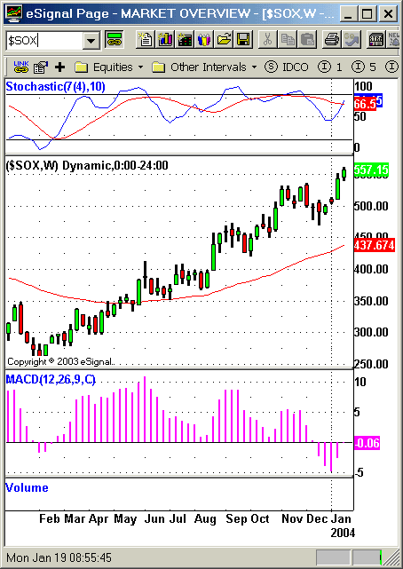
Figure 2: Weekly $SOX. A "ticking up" of the weekly MACD histogram in January 2004 suggests more upside ahead for semiconductor stocks. Once again, let's look to the semiconductors to see how much they have participated in this Nasdaq correction and advance. Turning to the $SOX, we see a process that looks remarkably like the one we saw in the Nasdaq, perhaps offset by a week or two. Not only does this suggest that the semiconductor group will participate in the rally that Nasdaq investors and traders are enjoying, but it also seems to hint that the semiconductors might still be a relative bargain, compared to the Nasdaq as a whole. As of this writing, the weekly MACD histogram in the $SOX has spent only one week in positive territory. If the semiconductors are indeed moving back up, then there will be plenty of histogram bars in positive territory to come. So the fact that the $SOX has only one weekly histogram bar in positive territory is, potentially, a bullish indication for semiconductors (Figure 3):
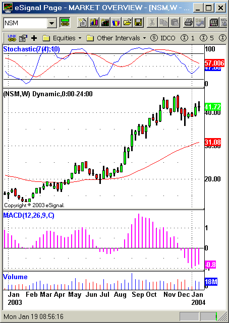
Figure 3: Weekly National Semiconductor. The "hooking up" of the weekly stochastic, accompanied by a "ticking up" in the weekly MACD histogram, are both bullish for National Semiconductor. This is when the time comes to turn from sector to stock. I've been keeping a set of spiral-bound index cards, with each card representing a different sector. On each sector card, I've written out the names of the stock components of that sector (or, rather, the stock symbols, in order to save time and space). This makes it very easy to move quickly from sector to sector. In addition, once I've found a sector I want to explore further, I have a ready-made list of stocks to study. Having all the stock symbols written out before me makes the process of sifting through them quite quick and easy. It can be surprising how much stock territory can be covered using this simple, yet methodical approach. There are 18 stocks that make up the $SOX. Moving from stock chart to stock chart, I looked for stocks with patterns similar to the ones I saw in the $SOX and the Nasdaq. While I wasn't looking for perfect matches, I did want to seek out stocks that either appeared to be oversold (based on the level of the stochastic oscillator mentioned), or had MACD histograms that had bottomed and begun to move upward. A number of semiconductor stocks — such as Novellus Systems (NVLS), Advanced Micro Devices (AMD), Applied Materials (AMAT), and National Semiconductor (NSM) — had weekly charts that suggested there was some merit in closer examination. Arguably, until this point in the "top-down" analysis, there is no reason to even bother looking at daily charts (Figure 4). The weekly charts, it could be said, help traders and investors focus on the big picture that the market is painting. The daily charts help show traders and investors just how, where, and when to take advantage of that big picture.
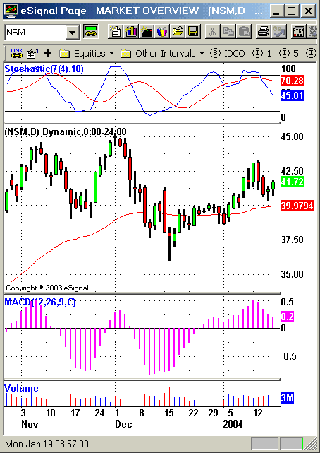
Figure 4: Daily National Semiconductor. The 50-day exponential moving average has provided support for rising prices in January.
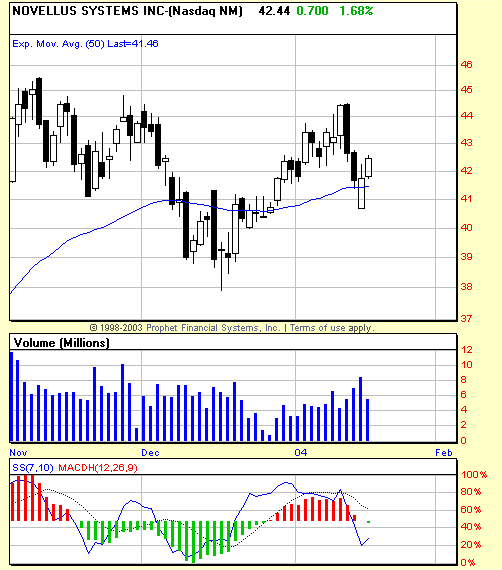
AS THE TECH TURNS . . .Moving to the daily charts, I still find the "ticking up" of the MACD histogram to be an effective way of determining which stocks are likely to have ended their corrections, however brief they might be. Switching time frames from weekly to daily also means putting more emphasis on the oscillator than the indicator, in this case emphasizing the stochastic somewhat more than the MACD histogram. This is to screen for those stocks that not only may have ended corrections, but are also oversold and have stochastic oscillators that have themselves "ticked up." Trader Linda Bradford Raschke refers to this as a "hook," and in generally advancing markets (uptrends), these buy hooks can be great signals for entry opportunities to the long side. On some charts, a buy hook can be quite pronounced and sharp, indicating what might be a strong reversal and resumption of the uptrend. On other charts, the hook is more of a curl or bend. In the daily chart of National Semiconductor, the stochastic's faster line is still moving down, which would prompt some caution even though the stock looks very good on the weekly chart. An example of a hook in the semiconductors might be the one developing in Novellus Systems (NVLS), as seen in Figure 5. Nevertheless, both stocks are deserving of investor and trader attention.
Figure 5: Daily Novellus Systems. An almost-perfect "buy hook" in the daily stochastic suggests the 50-day exponential moving average will provide support.
One of the additional advantages of sector trading is that the rise and fall of various sectors of the economy act as a blueprint of where the economy is in the business cycle. As the economy moves from expansion to contraction and back, certain sectors of the economy benefit from the shift in the availability of credit; the changing sentiment of investors; and the movement of interest rates (movement that comes both in response to economic conditions and in attempts to steer those conditions). In the present case, we see what appears to be renewed strength among the technology stocks. This is reflected both in the rise of the Nasdaq and the rise of semiconductor stocks. In the bull markets of the past several years, technology stocks have tended to be leaders rather than laggards, and when these stocks are being bid higher by investors it usually means that a new wave of bullishness, optimism, and expansion is about to ensue. This, by the way, does not mean that a "new bull market" of any specific duration has begun. What it does mean is that those stocks that are preferred during times of economic weakness — oil and pharmaceuticals stocks, for example — are likely to underperform, while early-expansion stocks such as technology, transportation and — to a lesser degree — financials (as in regional banks) will tend to outperform.
David Penn may be reached at DPenn@Traders.com.
SUGGESTED READINGConnors, Laurence A., and Linda Bradford Raschke [1995]. Street Smarts, M. Gordon Publishing Group.Elder, Alexander [1993]. Trading For A Living, John Wiley & Sons. Murphy, John J. [1996]. The Visual Investor, John Wiley & Sons. Nassar, David S. [2001]. Rules Of The Trade, McGraw-Hill. Schaap, Charles B. [2003]. "The 50-50 Strategy," December 10: Working Money.com. Stovall, Sam [1995]. Standard & Poor's Guide To Sector Investing, McGraw-Hill. Charts courtesy of eSignal, Prophet Financial Systems Current and past articles from Working Money, The Investors' Magazine, can be found at Working-Money.com. |
Technical Writer for Technical Analysis of STOCKS & COMMODITIES magazine, Working-Money.com, and Traders.com Advantage.
| Title: | Traders.com Technical Writer |
| Company: | Technical Analysis, Inc. |
| Address: | 4757 California Avenue SW |
| Seattle, WA 98116 | |
| Phone # for sales: | 206 938 0570 |
| Fax: | 206 938 1307 |
| Website: | www.traders.com |
| E-mail address: | DPenn@traders.com |
Traders' Resource Links | |
| Charting the Stock Market: The Wyckoff Method -- Books | |
| Working-Money.com -- Online Trading Services | |
| Traders.com Advantage -- Online Trading Services | |
| Technical Analysis of Stocks & Commodities -- Publications and Newsletters | |
| Working Money, at Working-Money.com -- Publications and Newsletters | |
| Traders.com Advantage -- Publications and Newsletters | |
| Professional Traders Starter Kit -- Software | |
PRINT THIS ARTICLE

Request Information From Our Sponsors
- StockCharts.com, Inc.
- Candle Patterns
- Candlestick Charting Explained
- Intermarket Technical Analysis
- John Murphy on Chart Analysis
- John Murphy's Chart Pattern Recognition
- John Murphy's Market Message
- MurphyExplainsMarketAnalysis-Intermarket Analysis
- MurphyExplainsMarketAnalysis-Visual Analysis
- StockCharts.com
- Technical Analysis of the Financial Markets
- The Visual Investor
- VectorVest, Inc.
- Executive Premier Workshop
- One-Day Options Course
- OptionsPro
- Retirement Income Workshop
- Sure-Fire Trading Systems (VectorVest, Inc.)
- Trading as a Business Workshop
- VectorVest 7 EOD
- VectorVest 7 RealTime/IntraDay
- VectorVest AutoTester
- VectorVest Educational Services
- VectorVest OnLine
- VectorVest Options Analyzer
- VectorVest ProGraphics v6.0
- VectorVest ProTrader 7
- VectorVest RealTime Derby Tool
- VectorVest Simulator
- VectorVest Variator
- VectorVest Watchdog

