

HOT TOPICS LIST
- Strategies
- Stocks
- Buy
- Investing
- Brokers
- Psychology
- Interviews
- Accumulate
- Sell
- Hold
- Spotlight
- Websites
- Candlestick Corner
- Gold & Metals
- Options Trading
LIST OF TOPICS
INVESTING
Trendlines And Relative Strength
11/22/00 03:47:19 PM PSTby Dennis D. Peterson
Trendlines and relative strength help an investor decide if a market, or sector of a market, is doing well and what to expect.
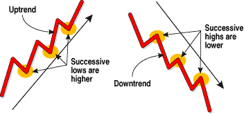
| Is the market up or down? You hear about this in the news every day. The term market usually refers to the broader indices such as the Dow Jones Industrial Average (DJIA), Nasdaq, or the Standard & Poor's 500. You also hear about market sectors, such as technology, that are doing well (or aren't, as the case may be). While the daily news is important, the trend of the market is even more important to an investor, especially if your time horizon for choosing what you buy or sell spans months, not years. How do you decide which investment is best? Trendlines provide insight into whether a market, sector, or security is trending up or down. Figure 1 shows the two trends. It shows that an uptrend has times when it goes down and a downtrend has times when it goes up. An uptrend is characterized by a succession of higher lows and a downtrend by a succession of lower highs. Studies have shown that in general, markets spend 30% to 50% of their time going sideways (that is, it is trendless), spend little time going down but make up for it by going down fast, and spend more time going up than down.
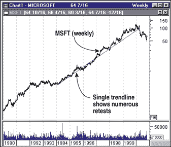
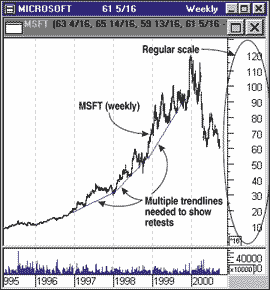
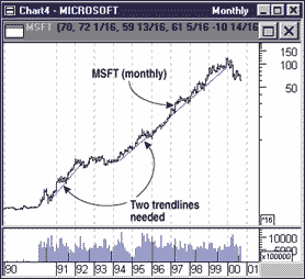
We chart stocks to show how their prices move over time. The points on the chart represent changes in time and price. If the stock is charted on the arithmetic scale, the distance between each point is the same. Each unit of time is an equal length along the x-axis, and each unit of price is an equal length along the y-axis. When you chart the constant rate of growth of a company on an arithmetic grid, the prices appear to curve upward and multiple trendlines are needed to fit the curve. It's difficult to see an uptrend or downtrend when you are looking at multiple trendlines. To make it easier, I prefer to use a semi-logarithmic scale. A semi-log scale creates one straight line when there is a constant rate of change. How does a semi-log grid work? A semi-log grid is exponential. Each point on the y-axis shows a percentage change in price. A change in price from 30 to 60 (100% change) has the same y-axis length as does a change from 60 to 120 (100% change). So when you look at a semi-log chart, you are comparing relative price changes.
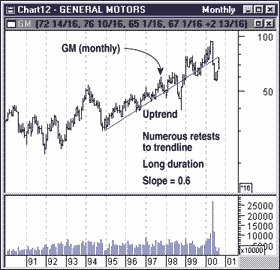
Figure 5 shows a monthly chart of General Motors (GM). If you compare Microsoft and GM, you will see that the slope of the lines is visually similar, except the value of the slope in Figure 4 is 1.3 and the one in Figure 5 is 0.6. Microsoft's stock is growing at twice the rate of GM.
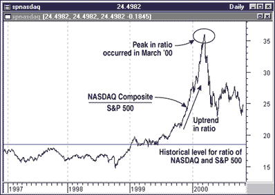
RELATIVE STRENGTH How strong is a market compared with other markets? A deceptively simple way to find out is to divide the values of one market by the other. The result of this division is relative strength. If you were to divide daily closing values of the Nasdaq by daily closing prices of the S&P 500, you would have the results in Figure 6. It shows that the Nasdaq is currently stronger than the S&P 500. It's not the actual value of the ratio you want, but the current value compared with a historical norm.
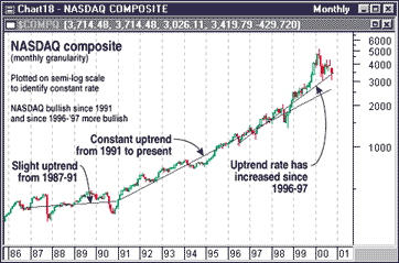
The Internet supplies ample sources of data for comparison. Suppose you decide the Nasdaq is the market of choice. What is the trend of the Nasdaq? A semi-log scale is an appropriate measure to determine if a constant rate of change has occurred. Figure 7 displays the result. A monthly chart is used to reduce the noise and identify long-term trends. The chart shows the Nasdaq is a strong market -- one worth looking into.
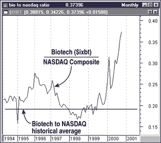
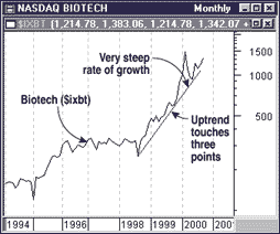
Now that you know about trendlines and relative strength, a combination of both these tools can help identify strong and weak sectors. Suppose you want to compare the performance of the biotech sector against the Nasdaq. Is the biotech sector itself trending up?
The most desirable investment area is the one that is in the strongest market with the strongest uptrend. Relative strength is an indicator that aids you in selecting a market. Once you identify this market, you may choose to invest in the entire market or a portion of it. Funds specialize in large-capitalization growth, technology, small cap, biotech, and so on. The list is enormous. Trendlines help us see if a market, sector, or stock has had constant sustainable growth. Sectors with slow rates of growth are generally less risky than those with high rates. We must keep in mind that with high reward also comes high risk. |
Market index trading on a daily basis.
| Title: | Staff Writer |
| Company: | Technical Analysis, Inc. |
| Address: | 4757 California Ave SW |
| Seattle, WA 98116-4499 | |
| Phone # for sales: | 206 938 0570 |
| Fax: | 206 938 1307 |
| Website: | working-money.com |
| E-mail address: | dpeterson@traders.com |
Traders' Resource Links | |
| Charting the Stock Market: The Wyckoff Method -- Books | |
| Working-Money.com -- Online Trading Services | |
| Traders.com Advantage -- Online Trading Services | |
| Technical Analysis of Stocks & Commodities -- Publications and Newsletters | |
| Working Money, at Working-Money.com -- Publications and Newsletters | |
| Traders.com Advantage -- Publications and Newsletters | |
| Professional Traders Starter Kit -- Software | |
PRINT THIS ARTICLE

Request Information From Our Sponsors
- StockCharts.com, Inc.
- Candle Patterns
- Candlestick Charting Explained
- Intermarket Technical Analysis
- John Murphy on Chart Analysis
- John Murphy's Chart Pattern Recognition
- John Murphy's Market Message
- MurphyExplainsMarketAnalysis-Intermarket Analysis
- MurphyExplainsMarketAnalysis-Visual Analysis
- StockCharts.com
- Technical Analysis of the Financial Markets
- The Visual Investor
- VectorVest, Inc.
- Executive Premier Workshop
- One-Day Options Course
- OptionsPro
- Retirement Income Workshop
- Sure-Fire Trading Systems (VectorVest, Inc.)
- Trading as a Business Workshop
- VectorVest 7 EOD
- VectorVest 7 RealTime/IntraDay
- VectorVest AutoTester
- VectorVest Educational Services
- VectorVest OnLine
- VectorVest Options Analyzer
- VectorVest ProGraphics v6.0
- VectorVest ProTrader 7
- VectorVest RealTime Derby Tool
- VectorVest Simulator
- VectorVest Variator
- VectorVest Watchdog