

HOT TOPICS LIST
- Strategies
- Stocks
- Buy
- Investing
- Brokers
- Psychology
- Interviews
- Accumulate
- Sell
- Hold
- Spotlight
- Websites
- Candlestick Corner
- Gold & Metals
- Options Trading
LIST OF TOPICS
THE OPTIMIZED TRADER
Trading The MACD Histogram, Part 1
12/06/06 01:30:25 PM PSTby David Penn
As good as the moving average convergence/ divergence is, adding the histogram might make it even better.
| One of the first trading methodologies I ever cobbled together was based on the moving average convergence/ divergence histogram, also known as the MACD histogram (or even the MACDH for short). I won't pretend my selection of the histogram came as the result of a scientific survey — though there was enough trial and error to make me feel as if some sort of canvassing of available indicators had certainly taken place. If anything, I was moved to spend more time getting to know the MACDH after reading this entry from Alexander Elder's excellent trading primer, Trading For A Living:
And later, under the heading "The strongest signal in technical analysis":
If that's not an endorsement, then I don't know what is. I'm not sure if Elder feels as strongly about the "MACD-Histogram" today in 2006 as he did back in 1993 when Trading For A Living was completed, but the indicator itself continues to have adherents. For example, Raghee Horner, forex trader and author, has used the MACDH as a general indicator to determine whether a market is bullish and ripe for buying or bearish and ripe for selling. I've written about the MACD histogram before for Working-Money.com, particularly about what I referred to as "MACDH extremes," which can often be helpful in determining intermediate-term direction after major market moves and when dealing with consolidations. Here, however, I want to talk about a few of the basic ways that traders can and have used the MACD histogram in order to trigger trade entries as well as determining directionality. |
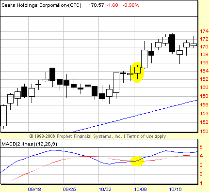
| MEET MR. MACD What exactly is the MACD histogram? What is its relationship to the moving average convergence/ divergence indicator known as the MACD? The MACD was developed by trader Gerald Appel, who also publishes the Systems and Forecasts newsletter. Although the MACD appears with two lines that converge and diverge relative to each other, the indicator is actually created using three lines. Writing in his book The Visual Investor, John Murphy explains how the MACD is constructed: The first line (called the MACD line) is the difference between two exponentially smoothed: moving averages of the price (usually 12 and 26 periods). The computer subtracts the longer average (26) from the shorter (12) to obtain the MACD line. A moving average (usually nine periods) is then used to smooth the MACD line to form a second (signal) line. The result is that two lines are shown on the chart, the faster MACD line: and the slower signal line. Buy and sell signals using the MACD are similar to those using other pairs of moving averages. When the fast MACD line crosses above the slow signal line, a buy signal has been issued. Conversely, when the fast MACD line crosses below the slow signal line, a sell signal has been issued. Approaching the MACD this way means that the trader will tend to be on the right side of the trend when following the signals. As I'll show later, there can be other tools that traders will use — from moving averages to trendlines to the MACD histogram — to determine whether the trend they may have received a signal to follow is one of significant duration, as in a bullish or bearish context. (See Figure 1.)
|
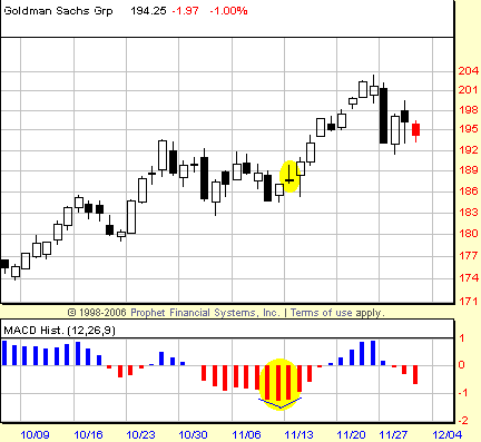
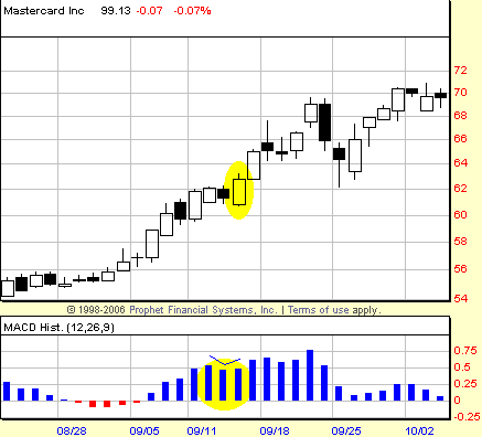
| For now, suffice to say that the MACD can be used on a variety of time frames using this simple crossover methodology. In addition, while John Murphy notes that some traders have elected to use different values for buy signals and sell signals, he underscores that for most traders, the 12, 26, 9 values will work for both bullish and bearish signals. There are two other ways that the MACD can be used. One is as an oscillator. Insofar as the two lines — the MACD line and the signal line — both operate above and below a zero line, some traders have used the MACD to indicate oversold market conditions that can be bought (both lines below the zero line) as well as overbought market conditions that can be sold (both lines above the zero line). Murphy points out that some traders combine the crossover and oscillator aspects of the MACD by looking for bullish crosses (remember, the MACD line crossing above the signal line) below the zero line indicating a buy and bearish crosses (the MACD line crossing below signal line) above the zero line as indicating a sell. Traders have also used the MACD to spot divergences. In much the same way that traders use oscillators like the RSI (relative strength index) and stochastics, traders look for instances when the MACD makes a lower high while a market is making a higher high (a negative divergence) or when the MACD makes a higher low while a market is making a lower low (a positive divergence). So where does the histogram fit into all of this? According to Murphy, in a way that makes it even better. He writes: As good as the MACD indicator is in the form just described, there's a way to make it even better. That technique is called the :MACD histogram. The MACD histogram will provide even earlier warnings of potential trend changes and greatly enhances the value of the indicator. Since the histogram shows the MACD crossover signals (in a slightly different way), nothing is lost in its use. What is gained is a way to generate action signals much sooner. As noted, this ability to create "action signals" ultimately won me over to the cause of the MACDH. The histogram simply represents the difference between the MACD line and the signal line, and plots it as a series of vertical bars. Other indicators such as the commodity channel index (CCI) can also be plotted as histograms. A positive histogram, with vertical bars above the zero line, indicates a market in which the MACD fast line (the MACD line) is above the slow line (the signal line). A negative histogram, by contrast, with vertical bars extending below the zero line, indicates a market in which the MACD line is below the signal line. When these two lines are close or are converging, the histogram bars will be shallow and small. When these two lines are diverging, moving away from each other, the histogram bars will increase in length — above or below the zero line. Another factor key in creating action signals is what Elder points out as the slope of the MACD histogram. He writes: The slope of MACD-Histogram is defined by the relationship between any two neighboring bars. If the last bar is higher (like the height of letters m-M), the slope of the MACD-Histogram is up. If the last bar is lower (like the depth of letters P-p), then the slope of MACD-Histogram is down. BREAKOUTS AND CONTINUATIONS
|
| Let's look at how the L1 and S1 breakout entries are created. To use Elder's shorthand, with a primary long or L1 trade, I am looking for a session in which the histogram slopes upward. There are a number of patterns that could produce this slope shift upward — from "M-m-M" to "P-p-P." Numerically, these values could be anywhere between +100 and -100, but for an example, imagine a histogram that reads +3, then +1.7, then +3.4. The session that received the "+3.4" in the second example would be the trigger session above the high of which the trader would be looking to get long. The key point is that the middle value or histogram bar is either shorter (in the case of a histogram above the zero line) or longer (in the case of a histogram below the zero line) than the pair of histogram bars that surround it on either side. Conversely, to the short side, a pattern like "m-M-m," "p-P-p," or, again numerically, reading -5, then -3.5, then -6. The session that received the "-6" would be the trigger session. Here, the difference is that the trader would be looking to sell or get short below the low of that "trigger session." See Figure 3.
|
| I began tracking a variation on this for those instances when a market was moving in a trend but the trend was not showing enough of weakness (in a bull trend) or strength (in a bear trend) to get the pattern key to a L1 or S1 buying opportunity. The continuation trade (or L3 and S3 as I dubbed it at the time) simply allowed the trader to go long above the high of any session that showed an increase in slope from the previous session (m-M). To the short side, a decrease in slope (as in "P-p") was all that was needed to signal a continuation trade to the downside. While this approach has been worthwhile, there are other methods (such as the BOSO method I wrote about a year ago) that do as good a job or better of tracking markets that appear unwilling to provide traders with a pullback (in a rising market) or a bounce (in a falling market) from which to gain a superior entry. Nevertheless, the continuation trade is one worth keeping in mind when a market advance appears well under way, and bargain entries prove themselves hard to come by. In part II, I will look at trading histogram divergences, how to trade crosses of the zero line, specific entry targeting, and exit strategies. SUGGESTED READING |
Technical Writer for Technical Analysis of STOCKS & COMMODITIES magazine, Working-Money.com, and Traders.com Advantage.
| Title: | Traders.com Technical Writer |
| Company: | Technical Analysis, Inc. |
| Address: | 4757 California Avenue SW |
| Seattle, WA 98116 | |
| Phone # for sales: | 206 938 0570 |
| Fax: | 206 938 1307 |
| Website: | www.traders.com |
| E-mail address: | DPenn@traders.com |
Traders' Resource Links | |
| Charting the Stock Market: The Wyckoff Method -- Books | |
| Working-Money.com -- Online Trading Services | |
| Traders.com Advantage -- Online Trading Services | |
| Technical Analysis of Stocks & Commodities -- Publications and Newsletters | |
| Working Money, at Working-Money.com -- Publications and Newsletters | |
| Traders.com Advantage -- Publications and Newsletters | |
| Professional Traders Starter Kit -- Software | |
PRINT THIS ARTICLE

Request Information From Our Sponsors
- StockCharts.com, Inc.
- Candle Patterns
- Candlestick Charting Explained
- Intermarket Technical Analysis
- John Murphy on Chart Analysis
- John Murphy's Chart Pattern Recognition
- John Murphy's Market Message
- MurphyExplainsMarketAnalysis-Intermarket Analysis
- MurphyExplainsMarketAnalysis-Visual Analysis
- StockCharts.com
- Technical Analysis of the Financial Markets
- The Visual Investor
- VectorVest, Inc.
- Executive Premier Workshop
- One-Day Options Course
- OptionsPro
- Retirement Income Workshop
- Sure-Fire Trading Systems (VectorVest, Inc.)
- Trading as a Business Workshop
- VectorVest 7 EOD
- VectorVest 7 RealTime/IntraDay
- VectorVest AutoTester
- VectorVest Educational Services
- VectorVest OnLine
- VectorVest Options Analyzer
- VectorVest ProGraphics v6.0
- VectorVest ProTrader 7
- VectorVest RealTime Derby Tool
- VectorVest Simulator
- VectorVest Variator
- VectorVest Watchdog