

HOT TOPICS LIST
- Strategies
- Stocks
- Buy
- Investing
- Brokers
- Psychology
- Interviews
- Accumulate
- Sell
- Hold
- Spotlight
- Websites
- Candlestick Corner
- Gold & Metals
- Options Trading
LIST OF TOPICS
THE CHARTIST
How Qualified Trends Would End Disaster
07/19/10 02:20:22 PM PSTby L.A. Little
Trends can be strong or weak, confirmed or suspect. Here's how to trade using them.
| Trading is predicated upon our assumptions about future events -- events beyond both our control and knowledge. In my article "Suspect Trends," I introduced the idea of trend qualification, comparing strength and weakness qualifiers to a trend. Casual observation suggests that not all trends are the same in terms of strength, durability, and viability; qualifying trends provides a trader with an exceptional edge. ABOUT TRENDS Most of the time, a trend transition isn't particularly dramatic, but as with most everything, there are exceptions to most rules. Over the years, there have been classic examples of stocks that turned from star performers to death traps -- examples include, but are not limited to, Worldcom and Enron from the early 2000s dotcom bubble and Shearson Lehman and Bear Stearns from the 2008 credit meltdown. Many investors lost the bulk of their monies in these debacles, and to this day, the majority probably believe there was little they could have done about it. "How could I have known?" is the oft-repeated phrase from such investors. Well, there is and was a way. The secret is in trend qualification, and some simple money management rules built around it. THE LATEST DEBACLE What follows is an accounting of the critical early events associated with the oil spill along with an analysis of how trend transitions were urging traders to exit. The charts always carry a message, as they are an instant reflection of the collective unconscious with respect to the stock they are charting. In this case it was BP, and it was a message to take partial profits and then get out. By following some simple rules regarding true trend, the losses the investors suffered could have been minimal. |
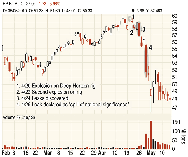
| THE ANATOMY OF A DISASTER BP has lost more than half its value as a direct result of the oil leak on the sea floor. On April 20, 2010, an explosion occurred on the deepwater drilling rig known as "Deepwater Horizon" in the Gulf of Mexico. Eleven people died as a result of the explosion, and that was the beginning of what subsequently has turned out to be the largest oil spill ever for the United States. Like so most events, the significance wasn't initially understood and the impact on the price of BP wasn't felt immediately. Two days later, a second explosion occurred, causing Deepwater Horizon to sink into the Gulf, taking with it a riser pipe that remained attached to the blowout preventer. The riser pipe, which normally goes from the wellhead to the drilling ship, broke as Deepwater Horizon sank. Four days after the original explosion, remotely operated vehicles inspecting the capsized rig found two oil leaks from the well pipe almost a mile down. The initial estimate was that up to 1,000 barrels of oil a day could be leaking into the water. This estimate was later revised to be at least 5,000 barrels per day. Now we know it was a lot more. On April 29, 2010, Secretary of Homeland Security Janet Napolitano declared the incident to be a "spill of national significance," enabling the appointment of a national incident commander to coordinate response resources at the national level. It was on this day that the greater impact of the spill was felt in BP's stock price. Even if an investor or a trader didn't follow the details of the spill as reported through the news media, the impact was felt in the charts, as it always is. Figure 1 is a daily chart with each of these events labeled on the day the event occurred. The final shaded oval captures the huge drop in price once the incident was declared "of national significance."
FIGURE 1: CHARTS TELL THE STORY. You can see the unfolding of events at British Petroleum (BP) since April 20, 2010. THE GREAT ESCAPE |
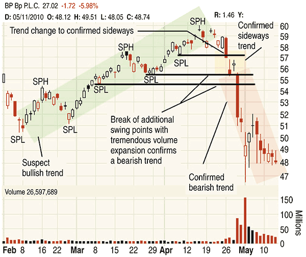 FIGURE 2: THE GREAT ESCAPE. From February to April 2010, a bullish trend was in effect that then turned sideways and finally bearish. The bullish trend was suspect because an analysis of how the swing points were broken on the way to higher prices reveals that volume contracted as prices broke higher.
In the case of BP in the February to April 2010 time frame, a bullish trend was in effect that turned sideways and finally bearish. The bullish trend was suspect because an analysis of how the swing points were broken on the way to higher prices revealed that volume contracted as prices broke higher. The highest three SPLs have lines drawn across them for easy reference. Note that item 3 (see Figure 1 for the timeline) resulted in a break of the highest SPL. The break came on increased volume compared with the SPL it was testing. Such an event results in a trend transition. In this case, the trend transitioned from suspect bullish to confirmed sideways. Anytime a trend changes from bullish (suspect or confirmed) to a confirmed sideways trend, it's a cautionary sign. A confirmed sideways trend says that it is more than likely that prices are not going back whence they came on this time frame. From a money management perspective it tells a trader to take partial profits or losses and be more careful. If a trader had listened to the market when BP transited trends, he would have exited 40% to 60% of his position at the $57 price point. That was only $3 off the highs. Finishing up Figure 2, the next transition came just three days later when BP broke the next two SPLs in one fatal swoop on the announcement that the oil spill was "of national significance." It was obvious from the outset of that day that volume was very heavy and prices were sinking fast. If we were to assume just a middle of the bar exit on the remaining positions, then an exit of $53.50 would have been the final exit number for the remaining shares. That was just about 10% of the highs for the year. All told, a trader trading based on trend transition of qualified trends would have probably lost around 5% even if he/she had bought at exactly the highest price of the year. What if you were not a short-term trader, but someone who holds stocks for weeks or months? How would you have fared? Not too badly, as shown in Figure 3. This chart is a longer time frame with weekly bars.
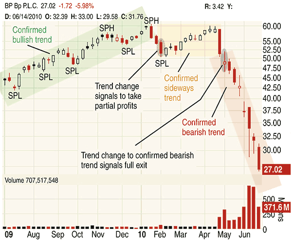
FIGURE 3: WOULD THE LONGER-TERM TRADER ALSO BE FOREWARNED? On this weekly chart, the trend was confirmed bullish on the way up but turned to confirmed sideways on the first big dip in February. That was the caution flag, which is where partial profits should have been taken. Once the bearish trend was confirmed, the remaining positions should have been closed. This would have minimized losses for the longer-term trader. In this chart, the trend was confirmed bullish on the way up but turned to confirmed sideways on the first big dip in February. That was the caution flag and is where partial profits should have been taken. Since the prevailing bullish trend was confirmed, 40% of the position probably should have been closed at that time. |
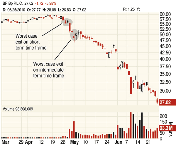
| For the next two months, BP inched higher until the events began to unfold in the Gulf waters. The large weekly spike down failed to break a swing point, but it was a warning flag because volume expanded greatly as price pushed into the SPL bar (the high of the SPL bar was $55.48). The very next bar broke the SPL and volume expanded, creating a confirmed bearish trend. It's time to exit the remaining positions for the trader who trades on this time frame as well! Longer-term trends have a longer lag. Therefore, in this case, 40% of your holdings in BP would have been closed at around $53 (assuming the midpoint of the bar that broke), and the remaining 60% at around $49. Longer-term time frame traders would have lost roughly 17% of their money if they had bought the exact highs. Although this would have seemed painful at the time, it would seem like a cakewalk compared to what has been lost for those who failed to sell. Figure 4 displays the exits for the short-term and intermediate-term traders. Failing to exit at these points would have resulted in devastating losses to your holdings.
FIGURE 4: PROTECTING YOUR LOSSES. Here you see points where you should have exited if you were a short-term trader and an intermediate-term trader. Failure to exit at these points would have resulted in devastating losses to your portfolio. ALL TRENDS ARE NOT EQUAL |
| SUGGESTED READING Little, L.A. [2010]. "Suspect Trends," Technical Analysis of STOCKS & COMMODITIES, Volume 28: February. _____ [2008]. Trade Like The Little Guy, BookSurge Publishing. |
L.A. Little is an author, professional trader, and money manager who writes for www.tatoday.com.
PRINT THIS ARTICLE

Request Information From Our Sponsors
- StockCharts.com, Inc.
- Candle Patterns
- Candlestick Charting Explained
- Intermarket Technical Analysis
- John Murphy on Chart Analysis
- John Murphy's Chart Pattern Recognition
- John Murphy's Market Message
- MurphyExplainsMarketAnalysis-Intermarket Analysis
- MurphyExplainsMarketAnalysis-Visual Analysis
- StockCharts.com
- Technical Analysis of the Financial Markets
- The Visual Investor
- VectorVest, Inc.
- Executive Premier Workshop
- One-Day Options Course
- OptionsPro
- Retirement Income Workshop
- Sure-Fire Trading Systems (VectorVest, Inc.)
- Trading as a Business Workshop
- VectorVest 7 EOD
- VectorVest 7 RealTime/IntraDay
- VectorVest AutoTester
- VectorVest Educational Services
- VectorVest OnLine
- VectorVest Options Analyzer
- VectorVest ProGraphics v6.0
- VectorVest ProTrader 7
- VectorVest RealTime Derby Tool
- VectorVest Simulator
- VectorVest Variator
- VectorVest Watchdog