HOT TOPICS LIST
- Strategies
- Stocks
- Buy
- Investing
- Brokers
- Psychology
- Interviews
- Accumulate
- Sell
- Hold
- Spotlight
- Websites
- Candlestick Corner
- Gold & Metals
- Options Trading
LIST OF TOPICS
TRADER'S NOTEBOOK
Timing Tops: Lessons From Bubbles Past
05/31/11 01:31:58 PM PSTby Michael Carr, CMT
The rate of change indicator is often overlooked by technicians, but it can offer timely signals.
| The rate of change (ROC) is often thought of as too simple to actually work. To calculate the indicator, all we need to do is find the percentage change in the price over a specific time frame. It uses closing prices, just like many other indicators do. It minimizes the math by using only the two data points of closing prices and performing a single operation (division) on them. Other indicators require more steps, and each step can be thought of as obscuring the message of the market action. THE UNBOUNDED INDICATOR Without an upper or lower limit, it is difficult to tell when the ROC has moved to a level that is too high or too low. This issue can be addressed by adding Bollinger bands to the indicator. Bollinger bands are an extremely useful trading indicator and are commonly placed on price. They also work very well on indicators. As a dynamic tool, they are not constrained by the bounds artificially placed on indicators like the RSI. |
| TOO HIGH OR TOO LOW? Bollinger bands are based on the idea of standard deviations. This is a mathematical tool designed to show how far away from the average a particular data point is found. There is much more to the concept of the standard deviation, and I am not even attempting to explain the math. My point is simply that there is an underlying logic to the Bollinger band indicator that is absent from many other technical tools. In the authoritative book on this indicator, Bollinger On Bollinger Bands, developer John Bollinger walks through the history of band-based indicators and explains what led him to use standard deviations. Using standard deviations allow the price action of the market to dictate what is too high or too low, given its recent history. Adding Bollinger bands to an indicator does the same. If the indicator moves above the upper Bollinger band, it is too high, meaning it is more than two standard deviations above the recent average level for the indicator. A move below the lower Bollinger band shows that the indicator has fallen to a level that is two standard deviations below the recent average. OR IS IT JUST RIGHT? Stock prices don't follow a normal distribution, but the assumption offers a useful stating point for analysis. Bollinger bands are usually placed two standard deviations above and below the average. When prices move above the upper band, it indicates that something unusual is happening. In stocks, we often see a reversion to the mean as prices start falling back to the moving average. In futures markets, except for stock indexes, a break of the upper band is often associated with a strengthening uptrend, and rather than betting on falling prices, a long trade could be initiated. Stocks and futures generally behave differently for a variety of reasons, and this is just one example of how you need to know what you're trading before putting real money at risk. |
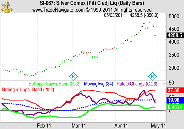
| ROC AND BOLLINGER BANDS Finally, we can examine the idea of using Bollinger bands on the ROC indicator. The indicator should follow the mean reversion behavior model. The ROC is more likely to be normally distributed than price data because it would be less dependent upon the previous data point. It is likely that you could use a time frame that greatly reduces the randomness in the data, but we'll look at using a 26-period ROC indicator for consistency. This is a six-month time period on the weekly charts and trends tend to show their greatest strengths in a three- to nine-month lookback period. Six is simply the midpoint of that, so there is no optimization in this example. Daily and monthly charts will look at the same time frame to be consistent. The daily chart of silver is shown in Figure 1. The ROC broke above the upper band on April 19, 2011, with the price near $44, just as silver was entering its runup toward $50. More important, the ROC broke back through the upper band to the downside on April 26 near $45, but only days before the top. This may not be a long-term top, but since prices fell by more than 25% from there, it is at least a significant top.
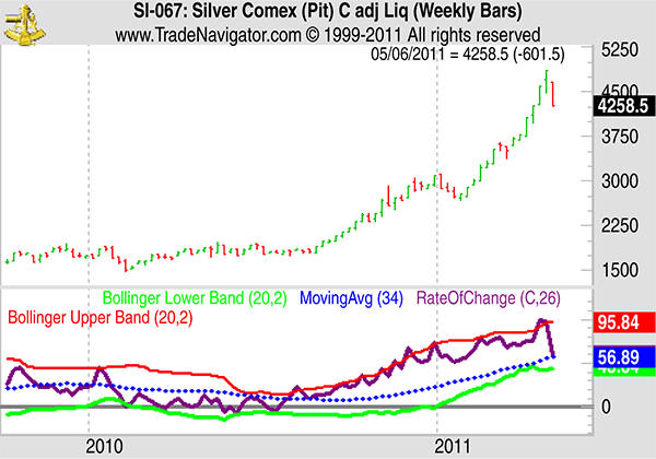
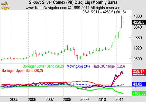
FIGURE 1: TAKING SHORT-TERM PROFITS. On this daily chart of silver, the ROC broke above the upper band on April 19, 2011, with the price near $44, just as silver was entering its runup toward $50. More important, the ROC broke back through the upper band to the downside on April 26 near $45, but only days before the top. Since prices fell by more than 25% from there, this is a significant top. The weekly chart (Figure 2) shows a similar pattern for the ROC indicator. Long-term traders can even look to monthly charts, as shown in Figure 3.
FIGURE 2: SELL SIGNALS ON WEEKLY CHARTS. Here you see a similar action in the ROC with respect to Bollinger bands as you did in Figure 1.
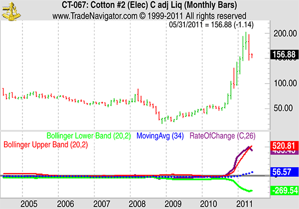
FIGURE 3: APPLYING IT TO MONTHLY CHARTS. Applying ROC and Bollinger bands on a monthly chart can help to identify significant turning points. This indicator behavior is not limited to silver. We saw the same thing in cotton. The monthly chart in Figure 4 helps frame the extent of the bullish move.
FIGURE 4: IT'S NOT JUST LIMITED TO SILVER. Cotton surged higher in the past few years with few traders noticing the profit opportunity. |
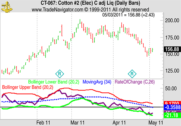
| The daily chart in Figure 5 shows that combining multiple time frame analysis would help traders avoid large losses. ROC failed to confirm the topping action seen in prices after the February peak. Prices fell 25%, but traders looking at the ROC framed within Bollinger bands would have been expecting a decline rather than a continuation move higher.
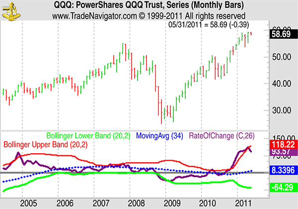
FIGURE 5: COMBINING MULTIPLE TIME FRAME ANALYSIS. The top in cotton prices is clear in hindsight, but ROC helped spot it before price action confirmed the end of the bullish surge. Bollinger bands are overlooked as a tool on indicators, and the ROC is an overlooked indicator. Combining the two can lead to profits in futures or stocks. We'll wrap up with two more charts and an example of this idea applied to stocks. The QQQ, the exchange traded fund that tracks the NASDAQ 100, shows that the ROC has reached an overbought extreme on the monthly chart, which can be seen in Figure 6.
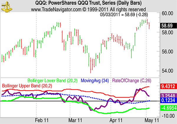
FIGURE 6: COULD THIS BE A SIGNIFICANT TOP? The ROC just broke back below its upper Bollinger band after an extended run upward. The daily chart of the QQQ, which can be seen in Figure 7, confirms the bearishness of the ROC. Seeing the same signal occur in multiple time frames adds credibility to the signal. Like many futures markets, stocks are signaling that caution is warranted at this time.
FIGURE 7: THE BEARISHNESS IS CONFIRMED. Seeing the same signal occur in multiple time frames adds credibility to the signal. The daily chart of QQQ includes a bearish signal from the ROC. |
| While the ROC has been the focus of this article, the bigger idea is that Bollinger bands should be applied to indicators. This can help add value to the indicator, and it may just add profits to your trading account. RELATED READING |
Mike Carr is a member of the Market Technicians Association and editor of the MTA's newsletter, Technically Speaking. He is a full-time trader and writer.
| E-mail address: | mcarr@dunnwarren.com |
PRINT THIS ARTICLE

Request Information From Our Sponsors
- StockCharts.com, Inc.
- Candle Patterns
- Candlestick Charting Explained
- Intermarket Technical Analysis
- John Murphy on Chart Analysis
- John Murphy's Chart Pattern Recognition
- John Murphy's Market Message
- MurphyExplainsMarketAnalysis-Intermarket Analysis
- MurphyExplainsMarketAnalysis-Visual Analysis
- StockCharts.com
- Technical Analysis of the Financial Markets
- The Visual Investor
- VectorVest, Inc.
- Executive Premier Workshop
- One-Day Options Course
- OptionsPro
- Retirement Income Workshop
- Sure-Fire Trading Systems (VectorVest, Inc.)
- Trading as a Business Workshop
- VectorVest 7 EOD
- VectorVest 7 RealTime/IntraDay
- VectorVest AutoTester
- VectorVest Educational Services
- VectorVest OnLine
- VectorVest Options Analyzer
- VectorVest ProGraphics v6.0
- VectorVest ProTrader 7
- VectorVest RealTime Derby Tool
- VectorVest Simulator
- VectorVest Variator
- VectorVest Watchdog

