

HOT TOPICS LIST
- Strategies
- Stocks
- Buy
- Investing
- Brokers
- Psychology
- Interviews
- Accumulate
- Sell
- Hold
- Spotlight
- Websites
- Candlestick Corner
- Gold & Metals
- Options Trading
LIST OF TOPICS
TRADER'S NOTEBOOK
Top Spotting: Knowing What You Need To Stay Out Of Trouble
08/01/14 02:57:24 PM PSTby Matt Blackman
Since April 2013, the S&P 500 index has put in a series of higher highs. So how high is too high? The end of the rally may be closer than you think.
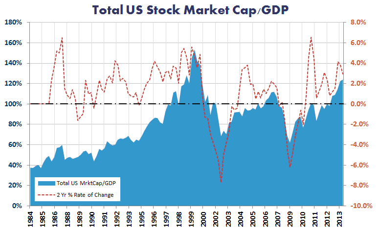
| Every major rally one day comes to an end, and the rally that began in 2009 is no exception. The trick is in not falling prey to the many false reversal alarms that contribute to the “wall of worry” on the way up and can keep you on the sidelines when there is money to be made. So how can a trader recognize when the risk-on trade is at the greatest risk of ending? Here are a few indicators and a projection to watch. WARREN BUFFETT’S METRIC The metric hit an all-time high of 154% in the first quarter of 2000. Since then, it has hit a low of 69% in July 2002 and another low of 62% in January 2009. It also hit another high in July 2007 of 107%. These extremes were followed by major lows and highs in US stock prices.
FIGURE 1: CHART OF WARREN BUFFETT’S FAVORITE STOCK MARKET VALUATION METRIC. Here you see the total US Stock Market Capitalization to GDP (blue) together with the two-year rate of change (red dashed line) showing quarterly data to Q1-2014. Data courtesy of St Louis Federal Reserve As you can see from Figure 1, absolute values are perhaps less important. The last two stock market peaks occurred at very different levels. What is more important is the direction and speed (rate of change) as shown by the red dashed line. But one fact seems certain — or at least as certain as any market indicator can be. The further that TMC/GDP gets from the 100% line in either direction, the closer stocks are to a top or bottom. But as long as the indicator is moving in the same direction — with the red dashed line rising in a bull or falling in a bear market — the current trend will remain in force. |
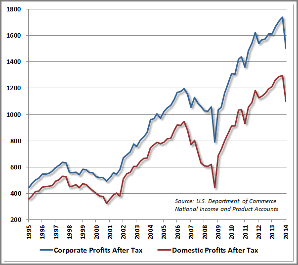
| MORE INDICATIONS Another indicator to watch is corporate profits. They hit a record high in late 2013 but have since turned south (Figure 2), and declining profits are not a sign of future growth.
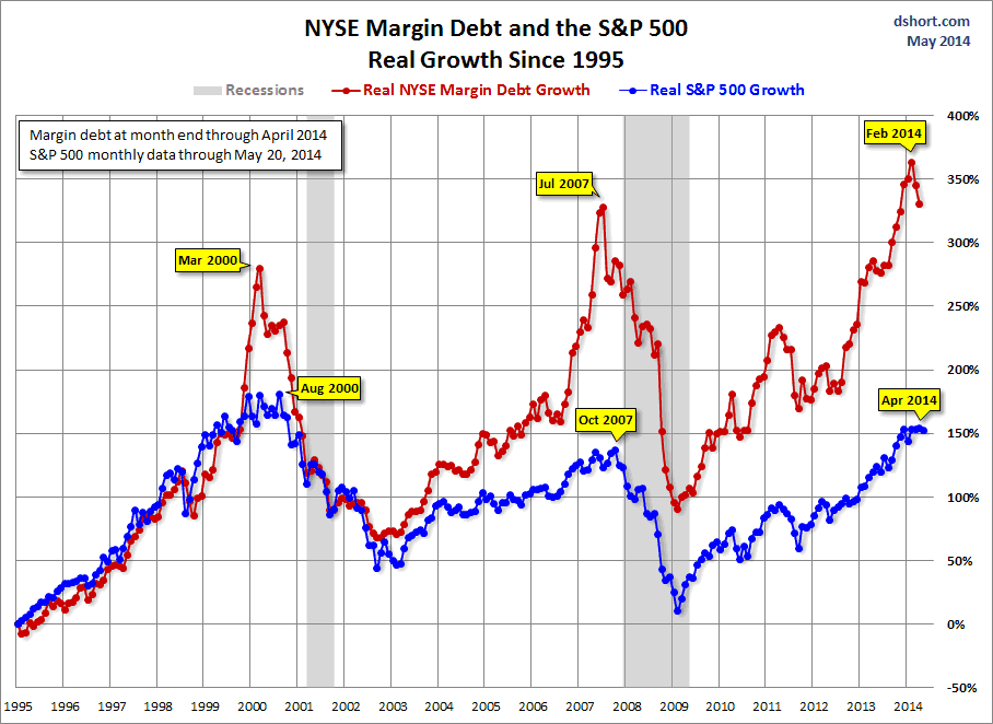
FIGURE 2: CORPORATE AND DOMESTIC PROFITS. Here you see corporate and domestic profits after tax from the U.S. Department of Commerce showing that both peaked in late 2013. Courtesy John Hussman https://twitter.com/hussmanjp Another useful metric is NYSE margin debt. The chart in Figure 3 (from Doug Short of www.advisorperspectives.com) shows the correlation between NYSE margin debt and real growth in the S&P 500. As you can see, peaks in margin debt have occurred shortly before the SPX peaked with the most recent margin debt peak occurring in February.
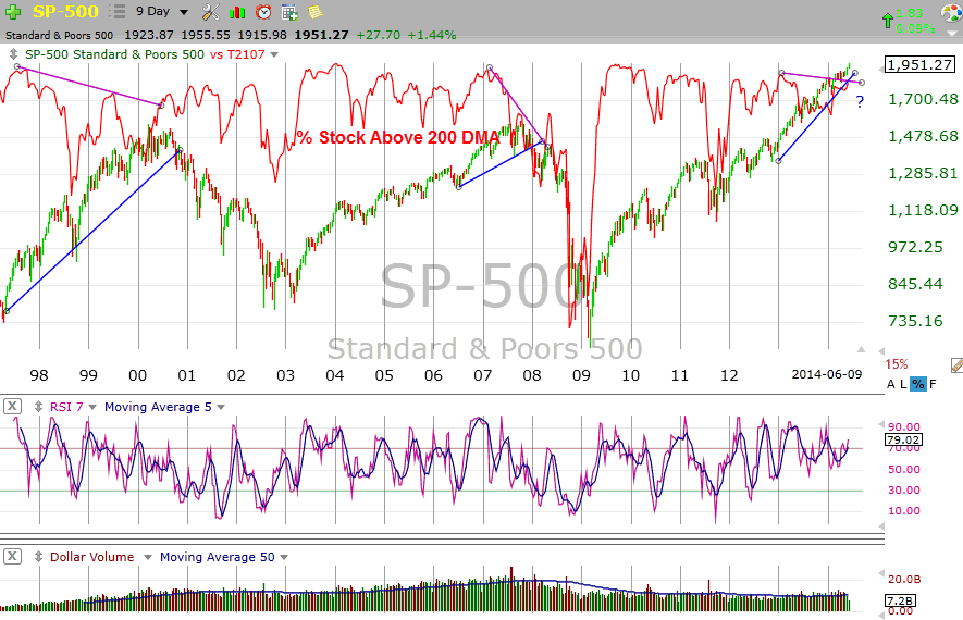
FIGURE 3: MARGIN DEBT. This chart compares real growth in the S&P500 versus NYSE margin debt since 1995. Chart courtesy http://advisorperspectives.com In my June 2014 Working Money article “Market Breadth — Divergence Key In Picking The Next Top” (http://technical.traders.com/tradersonline/display.asp?art=7972) I discussed how the divergence between market breadth and an index like the S&P 500 can provide prescient warnings of a coming reversal. Prior to the 2007 stock market peak, the percent of stocks trading above their 200-day moving average (MA) peaked at 86% in February and then dropped sharply, so that by the time the index had peaked in late October, just 51% of stocks in the S&P 500 were trading above their 200-day MA. There was a similar divergence leading up to the peak in March 2000 (see Figure 4). But what becomes painfully clear is that market breadth divergences can start years before a top is in place. So how are we supposed to know when the end is near?
FIGURE 4: MARKET BREADTH DIVERGENCE. Here you see a nine-day chart comparing the percentage of stocks trading above their 200-day moving averages and the S&P 500 index. Source: TC2000 |
| KNOW WHEN TO HOLD AND WHEN TO FOLD Warren Buffett’s favorite macro valuation indicator suggests that stocks are getting expensive, but it doesn’t tell us when they will be too expensive and a market top is at hand. Corporate and domestic profits also appear to have peaked, but again, they don’t provide a reversal timeline. Finally, neither the margin debt peak nor the market breadth divergences provide definitive reversal deadlines. Here’s another point to consider that, in my opinion, does make things different this time around versus prior peaks. Quantitative Easing (QE) has provided a significant lift for stocks, unlike the broader economy — a factor that was pretty much nonexistent at prior market tops. In other words, there is a strong chance that this effect could delay the inevitable correction by anywhere from a few months to a year or longer. No one really knows because it’s a new feature in the market landscape. But one thing is certain; The Federal Reserve understands the impact that QE has had on stocks, and they clearly support continuing to do so for the simple reason that optimism remains high while stocks are rallying. This confidence tends to keep people from disrupting the status quo. So don’t expect tapering to come in any form other than very gradually and with great caution. In the meantime, stocks are rallying as I write this in early July 2014, which favors the long side, and this outlook will continue until some event or news creates enough fear to cause investors to get defensive. So how will traders know when the next major reversal may finally be at hand? Ed Carlson, the host of SeattleTechnicalAdvisors.com and author of George Lindsay and the Art of Technical Analysis provides one credible answer to this question, including a projected reversal date range. His book rescued the work for posterity of George Lindsay, a stock guru who became famous in the 1960s for making month-to-month forecasts and pinpointing Dow Jones Industrial Average (DJIA) rallies and declines. He was singled out by Yale Hirsch of the Stock Trader’s Almanac, who called Lindsay’s 1969 forecast “the finest long-term forecast we have ever seen.” His last forecast in July 1987 just before his death accurately foretold that the “last high [for the DJIA] will come in August 1987.” According to Carlson, George Lindsay is the only analyst to ever create a disciplined methodology for forecasting the beginning and ending dates of secular cycles, and his methods hold the answer for today's investors. Lindsay’s work includes a rare phenomenon referred to as an “advance from a sideways movement.” Without going into the details as to how a sideways movement is forecast, you can think of this pattern as the multi-month period of distribution that we have grown accustomed to at the end of a bull market. Lindsay identified only two sideways movements (1880 and 1926) from which the DJIA rallied to new highs, rather than marking the end of a bull market, and in both instances, those rallies led to horrific bear markets. The year 2011 gave us only the third example of a sideways movement from which the DJIA rallied rather than fell. Given the paucity of previous occurrences to study, the challenge in timing the end of the bull market has been in knowing from which low of the sideways movement we should begin counting the final advance. Lindsay found that all advances and declines are contained within what he called the standard time spans: sub-normal, short, long, and extended. Each time span is a set number of calendar days in duration. For example, an extended advance is 929–968 days. |
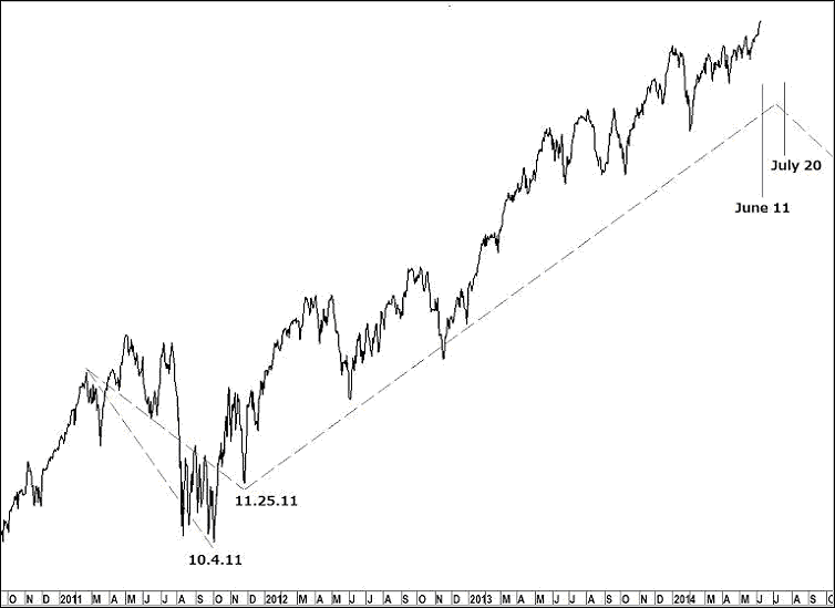
| The obvious low to count occurred on October 4, 2011 (Figure 5), but that low did not fit the description Lindsay left of counting from the sideways movement in 1926. He wrote that in this situation, the advance should be counted from the low from which the market rallies to a new high above the top of the sideways movement. That seems to point to the low on November 25, 2011.
FIGURE 5: WHICH LOW? Here you see a long-term chart from Ed Carlson detailing the Dow Jones Industrial Average sideways movement from the November 25, 2011 low to the projected termination of the pattern. Chart courtesy of http://seattletechnicaladvisors.com Counting from November 25, 2011, all possible standard time spans — except one — have expired; an extended basic advance 929–968 days forward in time brackets the time period of June 11–July 20 as the end of the bull market. PREPARING FOR BEARMAGEDDON? |
| What impact that QE has had on markets may only become obvious in retrospect, so it will be interesting to see how, and when, this bull ultimately ends. In the meantime, all we can do is to continue to trade in the direction of the primary trend with stops firmly in place and be prepared to reverse our trades when the time comes! FURTHER READING
|
Matt Blackman is a full-time technical and financial writer and trader. He produces corporate and financial newsletters, and assists clients in getting published in the mainstream media. He tweets about stocks he is watching at www.twitter.com/RatioTrade Matt has earned the Chartered Market Technician (CMT) designation.
| E-mail address: | indextradermb@gmail.com |
PRINT THIS ARTICLE

Request Information From Our Sponsors
- StockCharts.com, Inc.
- Candle Patterns
- Candlestick Charting Explained
- Intermarket Technical Analysis
- John Murphy on Chart Analysis
- John Murphy's Chart Pattern Recognition
- John Murphy's Market Message
- MurphyExplainsMarketAnalysis-Intermarket Analysis
- MurphyExplainsMarketAnalysis-Visual Analysis
- StockCharts.com
- Technical Analysis of the Financial Markets
- The Visual Investor
- VectorVest, Inc.
- Executive Premier Workshop
- One-Day Options Course
- OptionsPro
- Retirement Income Workshop
- Sure-Fire Trading Systems (VectorVest, Inc.)
- Trading as a Business Workshop
- VectorVest 7 EOD
- VectorVest 7 RealTime/IntraDay
- VectorVest AutoTester
- VectorVest Educational Services
- VectorVest OnLine
- VectorVest Options Analyzer
- VectorVest ProGraphics v6.0
- VectorVest ProTrader 7
- VectorVest RealTime Derby Tool
- VectorVest Simulator
- VectorVest Variator
- VectorVest Watchdog