HOT TOPICS LIST
- Strategies
- Stocks
- Buy
- Investing
- Brokers
- Psychology
- Interviews
- Accumulate
- Sell
- Hold
- Spotlight
- Websites
- Candlestick Corner
- Gold & Metals
- Options Trading
LIST OF TOPICS
INDICATORS
The Treasury Yield Curve Inverted Again - Should We Be Worried?
08/14/19 08:01:51 AM PSTby Matt Blackman
Since the 1960s, recessions have followed every time 10-year Treasury yields have dropped below 3-month yields and stayed there. This ratio turned negative in May. In this article we explore how to track this indicator using free, publicly available data.
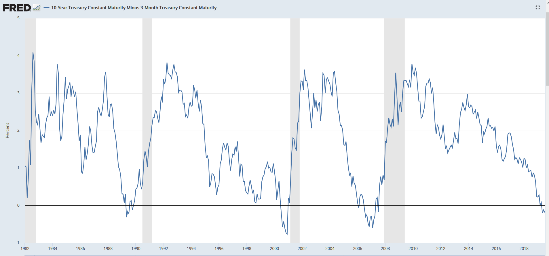
| A debate about how well the yield curve works in presaging U.S recessions arises each time it becomes inverted. Although a number of studies have been done, it would seem that the jury is still out if the opinions in the financial media are any indication. The challenge stems from the amount of time the yield curve remains inverted and the number of signals that have been generated since data has been collected. The yield curve is typically represented in a graph comparing Treasury yields from 3-month to 30-year using data from the U.S. Federal Reserve. The Fed Funds rate (interest rate at which depository institutions trade federal funds with each other overnight) is not typically included although as we will see below, it is worth examining. Typically, analysts compare the difference between 10-year and 3-month yields to prognosticate the health of the U.S. economy. A steep yield curve, when short-term rates are well below long-term, generally implies a growing economy. It shows that borrowers are paying less for long-term instruments such as 10-year Treasuries and instead seek higher returns in riskier investments (like stocks).
|
| But as the economy slows, there is often a flight to safety. Rising demand for long-term Treasuries drives bond prices up and yields down until they drop below that of shorter-term yields in a slowing economy. At this point stock markets have also become less attractive and in some cases entered a bear market, well before a recession is officially declared by the National Bureau of Economic Research (NBER). Strident yield curve followers would have witnessed that the daily 10-year Treasury yield (T10YR) first dropped below the 3-month Treasury yield (T3MO) rate on March 22, 2019 and stayed there for five days. Thirty one trading days later on May 13, the rate again dipped into negative territory and for all but six days (up to July 5 when the data were analyzed) stayed negative. What is significant is that the T10YR rate was below that of the T3MO for the second quarter of 2019, a signal that Professor Campbell Harvey of Duke University's Fuqua School of Business says has been accurate 100% of the time in presaging recessions. As part of his 1986 dissertation, Harvey showed that from 1960, a negative quarterly T10YR-T3MO reading presaged every recession. Since then, it has accurately predicted three more recessions retaining its perfect batting average. The most recent signal would be number four if confirmed. So how is a recession defined? Many have said that it occurs following two quarters of negative growth in the Gross Domestic Product (GDP). However, the NBER does not adhere to this characterization and instead defines a recession as "a significant decline in economic activity spread across the economy, lasting more than a few months, normally visible in real GDP, real income, employment, industrial production, and wholesale-retail sales." A depression is different from a recession in that it is marked by a prolonged period of economic stagnation and a significant decline in both incomes and employment. A more popular tongue-in-cheek explanation says that a recession occurs when someone else loses their job. It's a depression when you lose your job. |
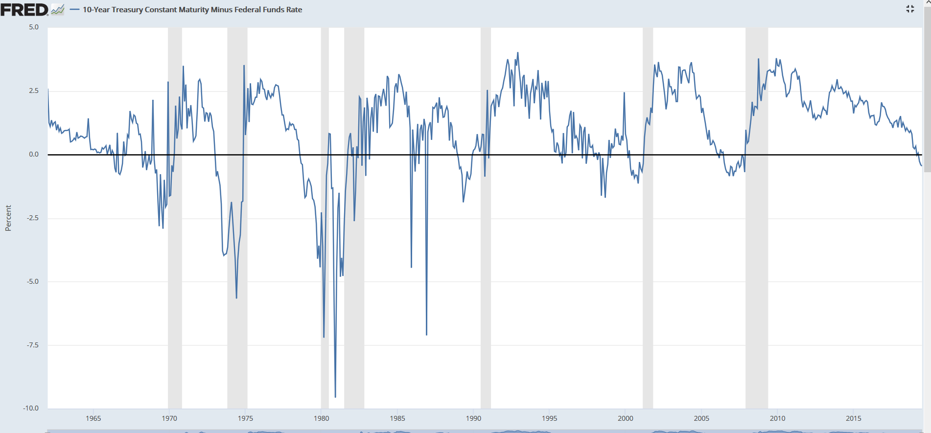
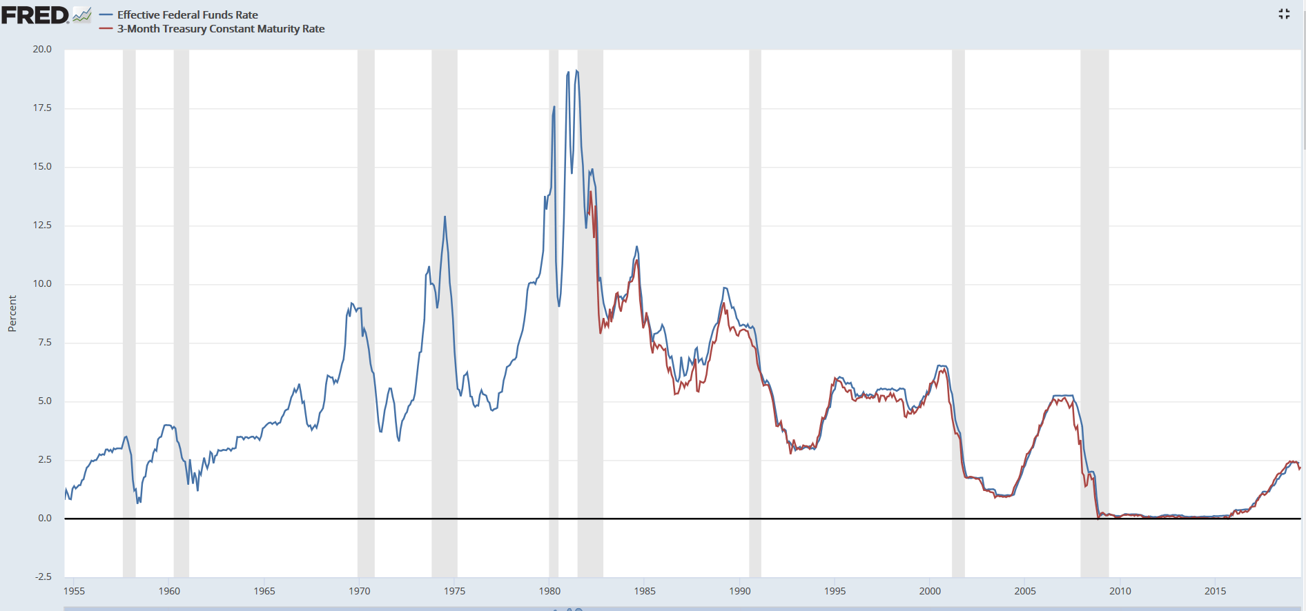 FIGURE 2: GRAPH COMPARING THE FED FUND RATE (BLUE) FROM 1955 TO THE 3-MONTH TREASURY YIELD (RED) PUBLISHED FROM 1982 SHOWING HOW CLOSELY THE TWO HAVE TRACKED. Unfortunately, no matter what recession definition you use, it is at best subjective. Using two quarters of negative GDP growth provides firmer parameters. However, relying on the NBER definition is anything but and so of little help for traders looking for concrete signals. The good news is that knowing when a recession (or depression) has arrived is less important in timing trades because by that point, your portfolio has already been hit. Wouldn't it be better to have advance warning and close the barn door rather than getting warning too late and watching your horse ride into the sunset? BUILDING THE PERFECT PLOT However, as we see in figure 2, the Fed Funds (FF) rate (in blue) is available back to 1955 and does a reasonable job of approximating the T3MO rate (in red) albeit at the cost of greater volatility and more false signals.
Here is one final indicator that can also be used to warn of a coming U.S. recession, albeit somewhat less reliable. The main advantage is the T10YR minus 1-year Treasury yields (T1YR) is the data dates back to 1962. As we see from Figure 4, it provided two 1970 recession warnings and a one-year advance warning of the 1974 recession. And although they were less pronounced than T10YR-T3MO signals, it also provided warnings of the next three recessions. |
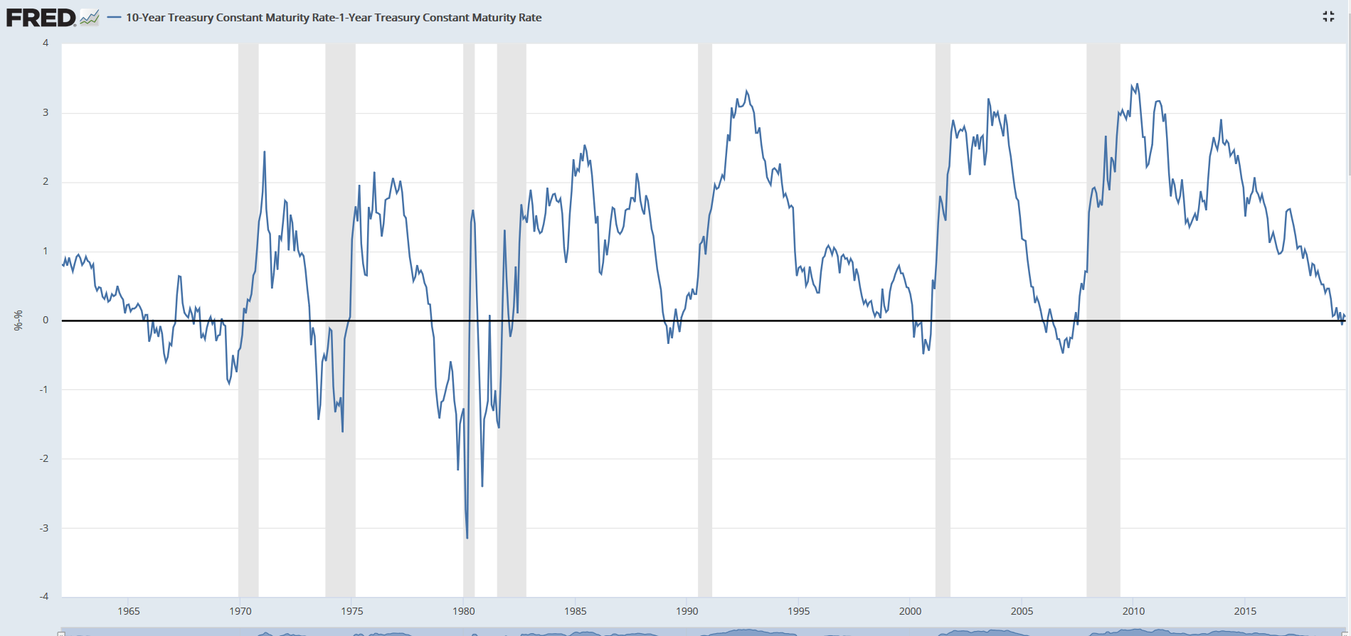 FIGURE 4: GRAPH PLOTTING 10-YEAR TREASURY MINUS 1-YEAR YIELDS GIVING LATER SIGNALS WITH A SHORTER-LEAD TO RECESSIONS. Since its not a recession but rather a bear market that is the greater risk to traders, how accurate were T10YR-T30MO signals in getting traders out of the market in time to miss the worst draw downs since post 1982?
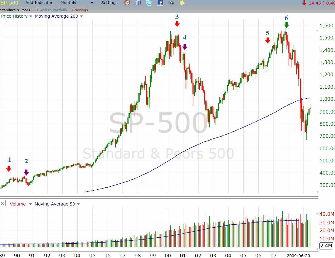
As we see in Figure 5, showing T10YR-T30MO confirmed signals by the red arrows (odd numbers) and confirmed recessions by purple arrows (even numbers) for the last three recessions, signals were about two years early to exit the 1991 and 2008 bear markets but nearly perfectly timed for a 2000-2001 bear market exit. FEELING LUCKY? A better way to use these warnings is as wake up calls to tell traders that the economy is slowing, no matter how strong GDP growth or low unemployment figures may seem. Armed with this information, we can then tighten our stops, reduce risk tolerance and become razor-focused on money management; not a bad idea no matter what the markets are doing! |
FURTHER READING
|
Matt Blackman is a full-time technical and financial writer and trader. He produces corporate and financial newsletters, and assists clients in getting published in the mainstream media. He tweets about stocks he is watching at www.twitter.com/RatioTrade Matt has earned the Chartered Market Technician (CMT) designation.
| E-mail address: | indextradermb@gmail.com |
PRINT THIS ARTICLE

Request Information From Our Sponsors
- StockCharts.com, Inc.
- Candle Patterns
- Candlestick Charting Explained
- Intermarket Technical Analysis
- John Murphy on Chart Analysis
- John Murphy's Chart Pattern Recognition
- John Murphy's Market Message
- MurphyExplainsMarketAnalysis-Intermarket Analysis
- MurphyExplainsMarketAnalysis-Visual Analysis
- StockCharts.com
- Technical Analysis of the Financial Markets
- The Visual Investor
- VectorVest, Inc.
- Executive Premier Workshop
- One-Day Options Course
- OptionsPro
- Retirement Income Workshop
- Sure-Fire Trading Systems (VectorVest, Inc.)
- Trading as a Business Workshop
- VectorVest 7 EOD
- VectorVest 7 RealTime/IntraDay
- VectorVest AutoTester
- VectorVest Educational Services
- VectorVest OnLine
- VectorVest Options Analyzer
- VectorVest ProGraphics v6.0
- VectorVest ProTrader 7
- VectorVest RealTime Derby Tool
- VectorVest Simulator
- VectorVest Variator
- VectorVest Watchdog

