

HOT TOPICS LIST
- Strategies
- Stocks
- Buy
- Investing
- Brokers
- Psychology
- Interviews
- Accumulate
- Sell
- Hold
- Spotlight
- Websites
- Candlestick Corner
- Gold & Metals
- Options Trading
LIST OF TOPICS
INVESTING
Stocks And The Art of Charts
11/22/00 03:46:46 PM PSTby Sharon Yamanaka
Are you trying to decide whether to buy or sell a stock? If you are, get out your stock charts. This simple method of analysis will make your decision easier.
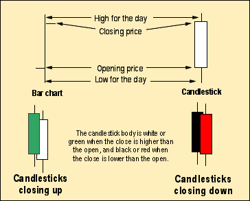
| Stock charts help you make investment decisions. They show the stock's history and, with a little analysis, can give you clues about the stock's future. Here's a four-step method of stock chart analysis, using lines, triangles, rectangles -- primary shapes -- as a foundation. The beauty of this method? It uses two visually oriented chart techniques, triangles and candlesticks, that you can easily see and use just by examining the chart. The analysis method we're going to look at uses candlestick charts and some classic chart patterns. What are candlesticks? What do we mean by chart patterns? Candlestick charts. These are really just bar charts, albeit in a different form. The Japanese developed them centuries ago to keep track of daily opening, closing, high, and low prices. Why are they called candlestick charts? It's simple -- the daily price movement looks like a candlestick. To form the body of the candlestick, draw a rectangle between the opening and the closing price (Figure 1). Next, draw a line from the top of the rectangle to the high price and from the bottom of the rectangle to the low price, forming a wick (also called a shadow). Then color in the candlestick -- red or black if the close price is lower than the open, white or green if the close price is higher than the open.
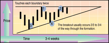
Triangle formations. These are used to find out if a price trend will continue. The top and bottom lines of the triangle are formed by connecting stock prices. These lines are called trendlines, and they can move up or down. If they converge, they form a triangle. The formation in Figure 2 is called an ascending triangle because the upper line of the triangle is flat and the lower line rises (ascends) to meet it. Here's how you form an ascending triangle; Draw a horizontal line through at least two upper points on a stock price chart. Underneath the horizontal line, connect two more points to form a line that angles up to the first line. The two lines will meet at an apex to the right of the chart, completing the triangle.
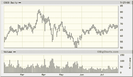
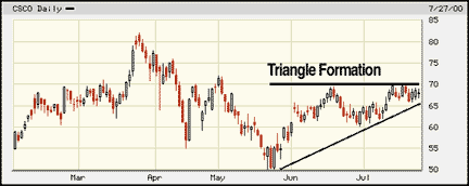
Now that you have some background, you're ready to tackle the charts themselves. STEP 1: CALL UP THE BAR CHART This basic bar chart of Cisco shows the daily open, high, low, and closing (OHLC) prices (Figure 3). (Trading volume appears along the bottom.) Cisco's price plummeted between April and June, but now it seems to be swinging up again. The price began climbing in July -- would you invest in this stock now?%A0 It's hard to decide until you analyze the chart.
FIGURE 3: CISCO, BASIC BAR CHART STEP 2: CONVERT TO CANDLESTICKS Figure 4 compares the components of bar and candlestick charts. The candlestick bodies (the rectangles that show the opening and closing price) highlight overall trends in the stock. The wicks (the lines at the top and bottom of the candlestick) represent the highs and lows of that day's trading range. If the candlestick is red or black, the stock price went down. A white or green candlestick means the price went up. These colors make it easier to pick out patterns.
FIGURE 4: CANDLESTICKS STEP 3: LOOK FOR TRIANGLES Ascending triangles are usually bullish (that is, the uptrend will probably continue) and they don't happen very often. That's why the ascending triangle in Cisco's chart is so exciting (Figure 5). When the stock price breaks through either of the triangle's lines, this indicates the direction the stock will take. But there's no guarantee that the stock will continue in the direction of the break. Technical indicators are not expected to be totally accurate, but they can help you beat the odds.
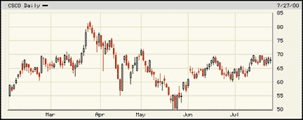
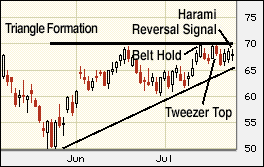
FIGURE 5: ASCENDING TRIANGLE FORMATION Cisco's triangle is more than three-quarters complete. At this point, the investor has two options; either buy stock now, or be cautious and wait to see which way the price breaks. STEP 4: ANALYZE MARKET SENTIMENT USING CANDLESTICK FORMATIONS Tweezer top, belt hold, pregnant woman (harami) -- these are just a few of the colorfully named one-, two-, and three-candlestick formations used to indicate market sentiment (Figure 6). Candlestick formations reflect the public's general attitude toward a stock, rather than giving buy and sell signals. The "Candlestick quick reference chart" describes these formations in more detail. The chart includes candlestick formations that signal three- to five-day trend reversals.
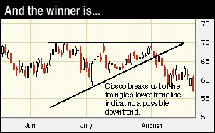
FIGURE 6: CANDLESTICKS FOR MARKET SENTIMENT The harami formation in Cisco's chart shows a smaller candlestick -- a baby -- engulfed by a larger candlestick of the opposite color. It signifies market indecision; the market isn't sure whether to go up or down. So the smaller the baby, the more definite the signal. The tweezer top and belt hold formations are bearish. They indicate the stock is going to break out lower and drop for at least a short time. But doesn't that contradict the "usually bullish" ascending triangle? Don't forget, there's an exception to every rule. That's why the cautious investor looks at both the triangles and the rectangles before buying or selling stock. The price of the stock declined, eventually going below $60 (Figure 7). Before we analyzed the charts, we weren't sure whether to invest in Cisco at $70. With the help of triangles and rectangles, however, the prudent investor chose not to buy and avoided an immediate 5% loss on his or her investment.
FIGURE 7: BUY OR SELL? TRIANGLES AND CANDLESTICKS: TOGETHER AT LAST Triangles and candlestick formations can be explained by supply and demand. They represent the buying and selling pressure on the availability of the stock. Theoretically, an ascending triangle forms when large blocks of stock are available at a particular price, and they usually follow an advance in the stock's price. Shareholders may feel they can get a set price for their stock, so they hold out for that price. This forms the upper horizontal line of the chart. In Cisco's case, that price was $70. When the price hit $70, those people sold their stock, and the stock didn't rise above that price. In fact, a resistance? level formed at the $70 mark. As the market became saturated, there were fewer buyers and the trading volume decreased. Once the stock's price rises above the $70 mark, given there are no other outside influences, the price would be expected to continue upward until another level of resistance forms. CONCLUSION The stock market displays random behavior, but there are times when the stock prices will react in a predictable manner to certain events. A systematic approach can often detect underlying rhythms in the stock market. If you can spot any of these trends, you can capitalize on your knowledge and invest accordingly. Investors have recognized the triangle formation for decades. When the formation occurs, there is a reasonable chance that the stock will continue in the direction of the breakout. Candlesticks indicate the direction of market sentiment. Investors should take advantage of these time-tested signals in their trading, soaking up the lore and ambiance of the market at the same time. |
| Title: | Staff Writer |
| Company: | Technical Analysis, Inc. |
| Address: | 4757 California AVE SW |
| Seattle, WA 98116 | |
| Phone # for sales: | 206 938 0570 |
| Fax: | 206 938 1307 |
| Website: | www.Working-Money.com |
| E-mail address: | syamanaka@traders.com |
Traders' Resource Links | |
| Charting the Stock Market: The Wyckoff Method -- Books | |
| Working-Money.com -- Online Trading Services | |
| Traders.com Advantage -- Online Trading Services | |
| Technical Analysis of Stocks & Commodities -- Publications and Newsletters | |
| Working Money, at Working-Money.com -- Publications and Newsletters | |
| Traders.com Advantage -- Publications and Newsletters | |
| Professional Traders Starter Kit -- Software | |
PRINT THIS ARTICLE

Request Information From Our Sponsors
- StockCharts.com, Inc.
- Candle Patterns
- Candlestick Charting Explained
- Intermarket Technical Analysis
- John Murphy on Chart Analysis
- John Murphy's Chart Pattern Recognition
- John Murphy's Market Message
- MurphyExplainsMarketAnalysis-Intermarket Analysis
- MurphyExplainsMarketAnalysis-Visual Analysis
- StockCharts.com
- Technical Analysis of the Financial Markets
- The Visual Investor
- VectorVest, Inc.
- Executive Premier Workshop
- One-Day Options Course
- OptionsPro
- Retirement Income Workshop
- Sure-Fire Trading Systems (VectorVest, Inc.)
- Trading as a Business Workshop
- VectorVest 7 EOD
- VectorVest 7 RealTime/IntraDay
- VectorVest AutoTester
- VectorVest Educational Services
- VectorVest OnLine
- VectorVest Options Analyzer
- VectorVest ProGraphics v6.0
- VectorVest ProTrader 7
- VectorVest RealTime Derby Tool
- VectorVest Simulator
- VectorVest Variator
- VectorVest Watchdog