HOT TOPICS LIST
- Strategies
- Stocks
- Buy
- Investing
- Brokers
- Psychology
- Interviews
- Accumulate
- Sell
- Hold
- Spotlight
- Websites
- Candlestick Corner
- Gold & Metals
- Options Trading
LIST OF TOPICS
TRADER'S NOTEBOOK
A Full Cuppa JOE
04/28/10 01:16:37 PM PSTby Alexander Elder, MD
SpikeTrade.com is a group of 20 professional and semiprofessional traders involved in a weekly competition. Each member submits his or her pick along with the entry, target, and stop. The picks are submitted in private, and then all is revealed on Sunday afternoon. At the end of each week, the Spiker who wins that week's competition writes up his or her analysis of the trade.
| In this article I will review the winning trade from the week ended March 19, 2010. The trader is Stephen M., a serious semipro. Steve is the newest Spiker, but he delivered the best performance of any Spiker during the first quarter of 2010, earning a diploma and a check. You can see his profile and the description of his trading style on the SpikeTrade.com website. Here is his review and analysis of his latest winning trade. — AE |
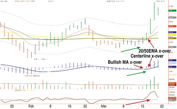
| JOE GOES DOWN! … NO! … UP! Florida-based real estate development company St. Joe Co. (JOE) is an interest rate-sensitive stock that the shorts have been all over recently. They loaded up as JOE bumped its support. While they were preoccupied with the expected rate change from the Federal Reserve, they were blind to the upward pressure from the undulating daily chart pattern that indicated bullishness (Figure 1).
FIGURE 1: JOE’S SMOKIN’. On this daily chart of JOE, note the upward pressure that indicated bullishness.
This slow rise caused the impulse system to change from red to blue and then to green. Soon the squeeze was on and the shorts panicked. The 4.9% surge on Wednesday, March 17, penetrated resistance as the shorts scrambled to cover (Figure 2). |
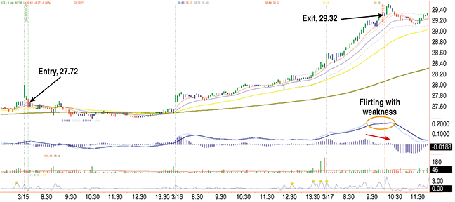
 FIGURE 2: MANAGING THE TRADE. Here you see the entry and exit points of the trade. Not too shabby.
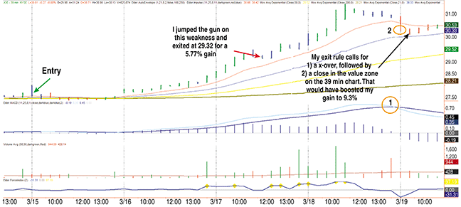
FIGURE 3: THE EXIT. On March 17, 2010, JOE surged up to 29.32, and then pulled back from this resistance point. It had already gone up $1.00 on that day, which was more than double the average daily trading range. At this point, the trader decided to lower his target to 29.32 and take a profit.
In conclusion, I felt that the Fed was not going to rock the market at this critical moment in the administration’s political future. This trade looked very appealing, with so many ready to panic if the price didn’t move their way. |
| The main lesson of this trade is that there are times when pivotal events can induce panic in a crowd that has been caught off-guard. On the minus side, I certainly could have been more patient with my entry by waiting for the upside reversal on the five- or 10-minute chart before pulling the trigger. Finally, the exit is where most of my careful and rational decisions should have been made. Normally, I use the five-minute chart for entries but only the 39-minute chart for exits. In this case, I got caught up in the short-term weakness forming on the five-minute chart and closed the position too early. There was an opportunity cost of this mistake: a 5.77% gain could have been 9.3%. The gain was nice, but the rule wasn’t followed, and that can lead to costly mistakes down the road unless corrected. —Stephen M. TRADE REVIEW
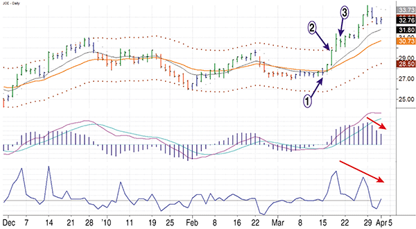
FIGURE 4: THE RIGHT EDGE. Any trade that captures more than 30% of the trade is an excellent trade. This trade certainly met that criterion.
Point 1 on the daily chart (Figure 4) indicates Steve’s entry, point 2 his exit, and point 3 shows where he wrote his comments. Here are my observations about his trade:
The SpikeTrade competition runs 52 weeks a year, and in our next article we will review another winning trade. Let’s see what lesson we can learn next month. |
| SUGGESTED READING Elder, Alexander [2010]. “The Rubber Band Effect,” Technical Analysis of STOCKS & COMMODITIES, Volume 28: June. _____ [2010. “Channel Trade Win,” Technical Analysis of STOCKS & COMMODITIES, Volume 28: May. _____ [2010]. “A Gem In The Junk Pile,” Technical Analysis of STOCKS & COMMODITIES, Volume 28: Bonus Issue. _____ [2010]. “How I Won My Gold,” Technical Analysis of STOCKS & COMMODITIES, Volume 28: January. _____ [2006]. Entries & Exits: Visits To 16 Trading Rooms, John Wiley & Sons. |
Alexander Elder is a professional trader based in New York City. He is the author of Come Into My Trading Room (Barron’s 2002 Book of the Year) and Trading For A Living, considered modern classics among traders. He also wrote Entries & Exits and Sell and Sell Short. He runs SpikeTrade.com with Kerry Lovvorn, a professional trader from Alabama. He may be reached at info@spiketrade.com.
PRINT THIS ARTICLE

Request Information From Our Sponsors
- StockCharts.com, Inc.
- Candle Patterns
- Candlestick Charting Explained
- Intermarket Technical Analysis
- John Murphy on Chart Analysis
- John Murphy's Chart Pattern Recognition
- John Murphy's Market Message
- MurphyExplainsMarketAnalysis-Intermarket Analysis
- MurphyExplainsMarketAnalysis-Visual Analysis
- StockCharts.com
- Technical Analysis of the Financial Markets
- The Visual Investor
- VectorVest, Inc.
- Executive Premier Workshop
- One-Day Options Course
- OptionsPro
- Retirement Income Workshop
- Sure-Fire Trading Systems (VectorVest, Inc.)
- Trading as a Business Workshop
- VectorVest 7 EOD
- VectorVest 7 RealTime/IntraDay
- VectorVest AutoTester
- VectorVest Educational Services
- VectorVest OnLine
- VectorVest Options Analyzer
- VectorVest ProGraphics v6.0
- VectorVest ProTrader 7
- VectorVest RealTime Derby Tool
- VectorVest Simulator
- VectorVest Variator
- VectorVest Watchdog


